This post contains affiliate links. If you grab one of the printables I recommend, I may earn a small commission at no extra cost to you.
The wall above the dresser in our bedroom sat empty for two years. Not on purpose. I just kept walking past it with laundry in my arms thinking, later. Then one Saturday in September I printed a leaf drawing on cheap paper, stuck it up with blue painter’s tape, and stood there squinting at it like I was at a gallery opening.
That tape trick is the whole method, honestly. Print the file small, tape it up, live with it for three days before you spend a cent on frames. Half of what I was sure I loved came down by Tuesday. The other thing I finally learned: the art has to match the room, not the seasonal aisle. Soft watercolor-style leaves settle into a neutral living room. A folk harvest print wants wood nearby, a pine shelf, an oak headboard. Stark black line art goes where the room is already quiet and a little minimal.
My brother hangs everything at our place now because he has a level app on his phone and zero patience for a crooked frame. He measured the dresser wall twice before he let me pick anything. Everything below is a printable file from an indie design shop, and some links are affiliate links, so if you grab one I might get a small cut. Costs you nothing. Tape first, frames later.
A Grid of Tiny Harvests for the Kitchen Wall
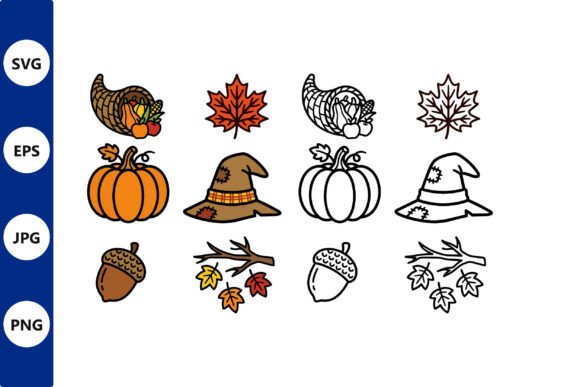
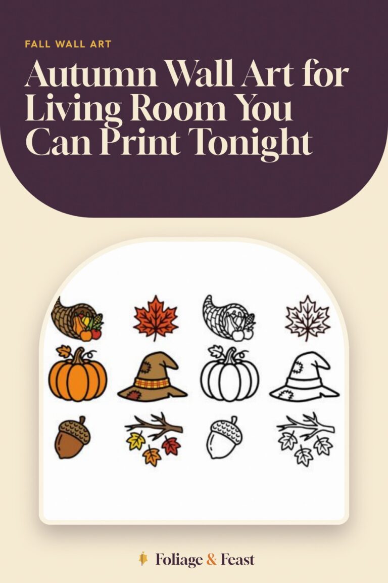
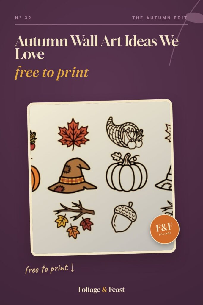
This one is a full set of little harvest drawings in color, and because it is vector art, you can scale a single pumpkin up to poster size and the edges stay crisp. I did the opposite. Nine icons on one sheet, a tidy grid, printed at 8×10 and framed in thin oak by the kitchen window.
One nitpick: the palette runs hot. Lots of orange. Against my beige kitchen wall it worked, but in the living room it shouted over the sofa, so I dropped the saturation a touch before printing. Two minutes in any free photo editor and it calmed right down.
Line Art Harvest for Rooms That Hate Clutter
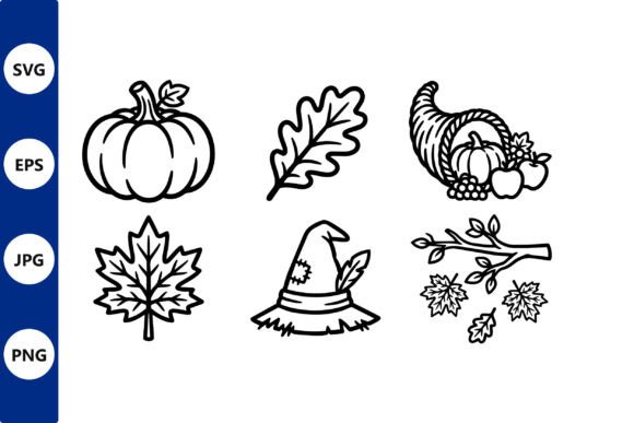
Same harvest idea, but drawn in single-weight lines with no fill, which makes it the set for a room that is already quiet. White walls, pale sofa, nothing competing. I printed three icons on separate sheets, taped them in a row over the entry bench, and lived with the spacing for a full week before I committed to frames.
Go 8×10 or bigger. I tried 5×7 first and the thin lines all but vanished from across the room. Fine leaned on a shelf, invisible on a wall.
The Girl With the Leaves Won the Dresser Wall
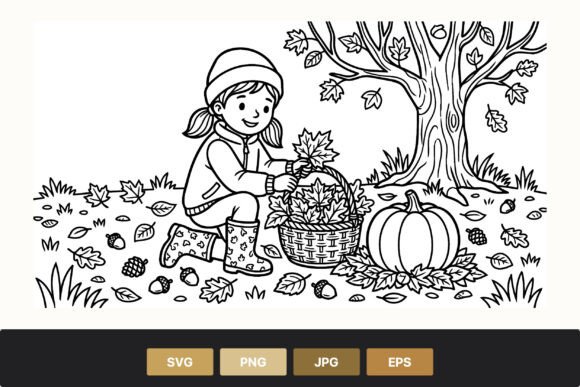
The dresser wall winner. One continuous-line drawing of a girl gathering leaves, and it is the calmest thing I own. I taped the test print up on a Thursday, meant to give it the usual three days, and by Sunday morning I had already ordered the frame. Some auditions end early.
Heads up on proportions: the drawing runs tall. My square frame cropped the leaves right out of her hands, so measure before you commit. It ended up in an 11×14 with a wide white mat, and now the laundry pile under it looks almost intentional.
Pumpkin, Lantern, Boots: a Triptych That Assembled Itself
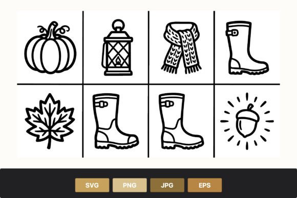
Three motifs in one file: pumpkin, lantern, rain boots. That is a ready-made triptych if I ever saw one. Ours runs down the bedroom hallway in three matching black frames, two inches apart, and my brother spent twenty minutes with the level app on his phone because the middle frame was, quote, a degree and a half off.
Tape blank paper rectangles up first to test the spacing. Two inches apart reads tight and deliberate, six inches reads like an accident. Also the lantern prints darker than the other two, so hang it in the middle where it anchors the row instead of on the end where it tips the whole thing sideways.
Black and White Icons Beside the GATHER Print
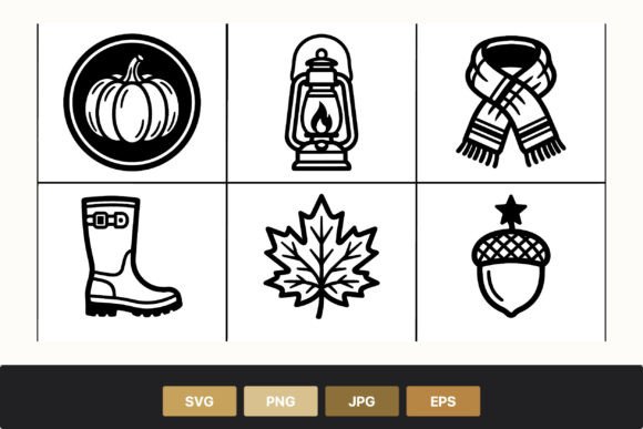
Pure black on white, no color anywhere, which is exactly why it works next to typography prints and minimal rooms. I framed one icon beside a text print that just says GATHER, and the two of them finally made that awkward corner look decided instead of unfinished.
Print it on bright white cardstock, not cream. And check your black ink first. Mine was running low and the whole sheet came out charcoal, which reads less minimal and more sad photocopy. I noticed after I had trimmed it. Of course I did.
Scarf Weather, Hung in a Pair
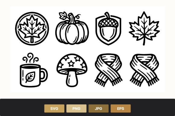
Pumpkin, scarf, leaf. I know, another trio, but this one I split: two prints as a pair flanking the bedroom mirror, and the scarf stayed in the folder until it became a November card. Pairs are underrated. A pair frames a mirror or a window without demanding a whole wall to itself.
If you mat these, give the scarf motif extra margin. It stretches wider than the other two, and my first mat crowded it right to the edges. The replacement mat cost me a second trip to the craft store. Learn from that one.
The Folk Basket That Refused Every Frame but Walnut
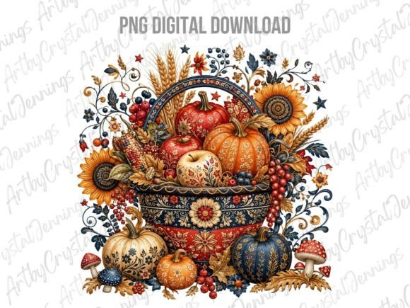
This is the folk piece, a harvest basket with that hand-painted, slightly retro look, and it flat refuses to hang near anything glossy. It wants wood. Ours sits in a walnut frame above the wooden sideboard where we dump keys, and it looks like it has been in the family since before I was.
It is a PNG, not vector, so keep it at 16×20 or under. I pushed a test to 24×36 at the print counter and the edges went soft. At normal frame sizes it prints clean on my tired home inkjet, no complaints.
Stitched Leaves, No Sewing Required (by Me, Anyway)
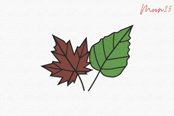
This one is stitch art, an actual embroidery design of a maple leaf and a green one, so it is the odd duck of the list. My sister owns the family embroidery machine, and she ran the maple on oatmeal linen for me. Hooped it, hung it next to the printed pieces, done. Real thread on a wall of paper prints adds a texture no inkjet can fake.
No machine? Ask around. Someone in your orbit has one and is dying for an excuse to use it. My only note: the default green stitched out brighter than our sage bedding, so we swapped thread colors. Thirty seconds, saved the whole piece.
Doodles for the School Poster Assembly Line

The doodle set is the school poster workhorse. When my nephew needed a fall poster for his classroom, we snipped acorns and leaves out of this file and scattered them around his bubble letters, and the finished thing looked like he had drawn a hundred tiny doodles instead of pasting twelve. It also makes sweet playroom art, four doodles in a grid of small frames.
One thing: the doodles arrive as a full clipart sheet, so you will spend a few minutes cropping out the pieces you actually want. Not hard. Just not instant, and not a job for the night before the poster is due. Ask my nephew.
One Proud Turkey for the First Week of November
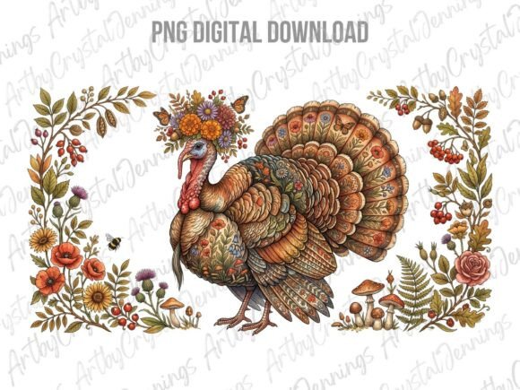
And the turkey. Folk style again, chest out, proud as anything, and it is the piece I swap in the first week of November. The painter’s tape marks stay hidden behind my October print, the turkey goes up in the same frame, and nobody ever clocks the change. An 8×10 propped on the dresser works too if your walls are already spoken for.
The palette surprised me: there is a teal accent in the tail feathers that does not show in the small thumbnail. It happened to sit fine with our sage bedding, but hold it up against your room before you print a second copy for your mom. She will ask for one.
Frequently Asked Questions
How to stop posters falling down?
Nine times out of ten the wall is the problem, not the tape. Dust, or a film of kitchen grease if you are anywhere near the stove. Wipe the spot with a barely damp cloth, let it dry all the way, then stick. Blue painter’s tape for test prints, adhesive strips rated for actual weight for anything staying up past a week.
Humidity is the quiet killer. The hallway by our bathroom ate three posters before I admitted that corner needed a frame, not better tape.
How to keep a poster from falling off the wall?
If it is unframed, kill the curl first. Roll the poster gently backwards and leave it under a stack of cookbooks overnight. Flat paper holds on; curled paper peels itself off by Thursday, usually at 2 a.m. with a sound that will wake you.
Then run tape or strips along the full top and bottom edges, not just the corners. Corners are where the peel starts. And past a certain size, a cheap frame beats every adhesive trick I have ever tried.
Can I print these at home?
Yes, and I do, on an inkjet that has seen things. Cardstock is what makes it look like art: 65 lb feels like a real print, regular copy paper feels like a flyer. For anything bigger than 8.5×11 I send the file to the library printer or the print shop counter, which usually costs less than the fancy coffee I buy while I wait.
Do one draft on cheap paper first for the tape test. Save the cardstock for the copy that gets the frame.
What file formats do these designs come in?
Mostly PNG and JPG, which any home printer or print counter will take without blinking. The vector sets also include scalable files, and that is what lets you blow one little icon up to poster size with clean edges.
The stitch art is the exception: it comes in machine embroidery formats, so that one feeds a machine, not a printer. Every listing spells out what is in the folder, and it is worth the ten seconds to check before you buy.
Before You Print
The dresser wall took two years to fill and one afternoon to finish, which tells you where the real bottleneck was. Print small, tape it up, walk past it for three days with laundry in your arms. You will know by Tuesday.
My brother still checks the hallway triptych with his level app every time he visits. It has not moved since October. He checks anyway.