This post contains affiliate links. If you grab one of the printables I recommend, I may earn a small commission at no extra cost to you.
Every November I clear the framed family photos off one living room wall and put up a little gallery of Thanksgiving prints instead. It is the cheapest decorating swap I do all year. Print the art, slide it into frames I already own, hang it on the same nails the photos left behind, done. The wall does the heavy lifting and I barely lift a finger.
My sister came over to help this year. I use the word help generously. She has strong opinions about spacing and zero patience for measuring, so mostly she stood back and told me a frame was crooked while I was the one holding the level. We have done this dance our whole lives. The wall did come out straight, for the record.
The only real mistake was mine. I tried to cut a custom mat board with a blade that had gone dull and the edge came out crooked and chewed-looking, so I bought a fresh blade and recut it the next day. Some of the prints below are ones hanging in my living room right now, and a few links are affiliate links, so if you grab one I might earn a small cut. No cost to you.
The Pattern I Use as a Backing Layer
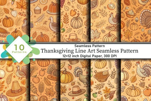
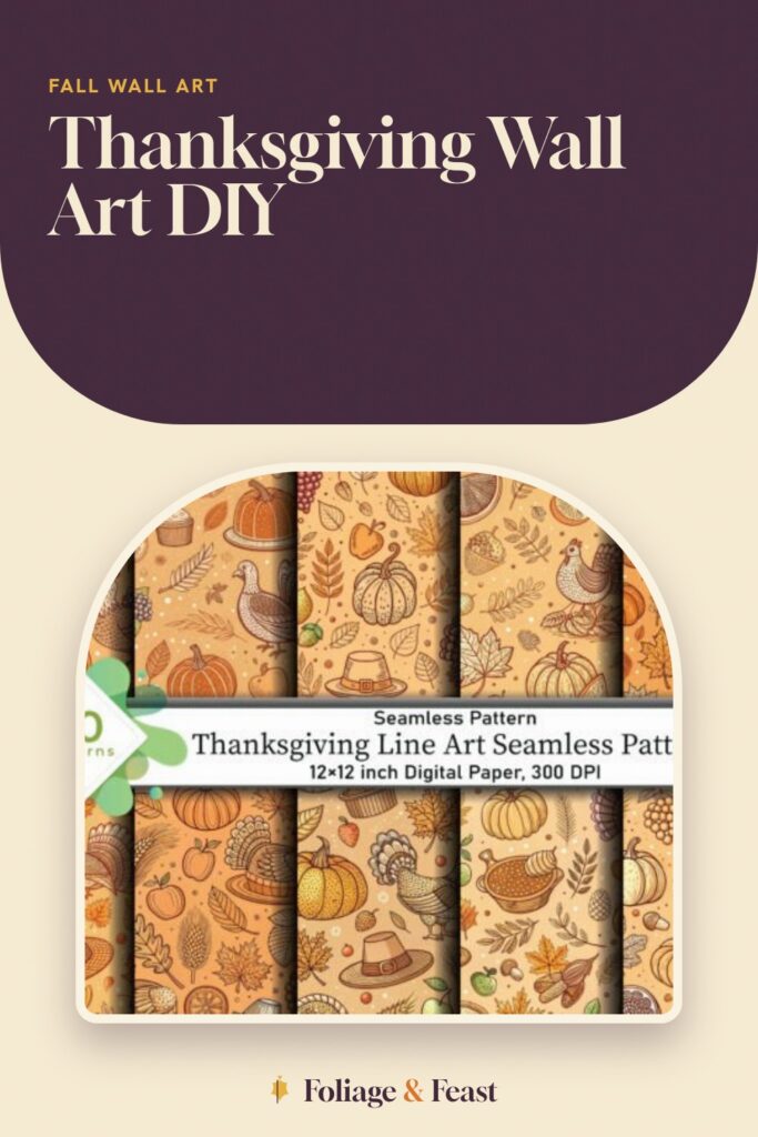
This is a seamless line-art pattern, the kind that tiles forever with no visible seam, and I do not frame it on its own. I print it large and use it as a backing layer, sliding it behind a smaller print so the empty mat area has some quiet texture instead of blank paper. It reads as intentional. People think I planned it.
The thin line style keeps it from fighting whatever sits on top, which is exactly what you want from a background. I ran mine in a soft rust so it whispers rather than shouts.
Nitpick: because it is a repeating pattern, you have to mind where the tile lands inside the frame opening, or you end up with half a turkey cut off awkwardly at the edge. I nudged the image around in the print preview until the crop sat right.
The Folk Turkey That Anchors the Whole Wall
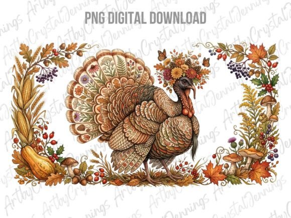
Every gallery wall needs one piece that is clearly the star, and this folk-art turkey is mine. Bold shapes, a little naive charm, the kind of art that looks hand-painted even though it came out of my inkjet. I gave it the biggest frame and hung it slightly off-center, which is the trick to a wall that looks collected rather than catalog-perfect.
I printed this one on heavier matte stock, 110 lb, because the larger the print the more a flimsy sheet ripples behind glass. Heavy paper sits flat and the folk colors stay rich.
Nitpick: it is a PNG on a transparent background, so I had to drop it onto a cream rectangle myself before printing, otherwise it floats with no edges. Two minutes in a free editor, but worth knowing before you hit print.
A Second Folk Turkey for the Pair Across the Room
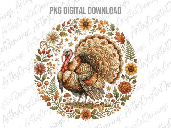
I liked the first folk turkey enough that I wanted a companion for the opposite side of the room, and this one plays the part well. Same folk-art spirit, different posture and palette, so the two read as a set without being twins. Symmetry across a room, asymmetry within each piece. That is the balance I chase.
I matched the frame to the anchor turkey and hung this one at the same height so your eye bounces between them. My sister actually approved of the spacing here, which I am noting for the historical record.
Nitpick: the colors run a touch warmer than the first turkey, more ochre than rust, so side by side under a lamp the mismatch was faintly visible. I leaned into it instead of fighting it and called it depth.
The Delicate One for the Narrow Gap
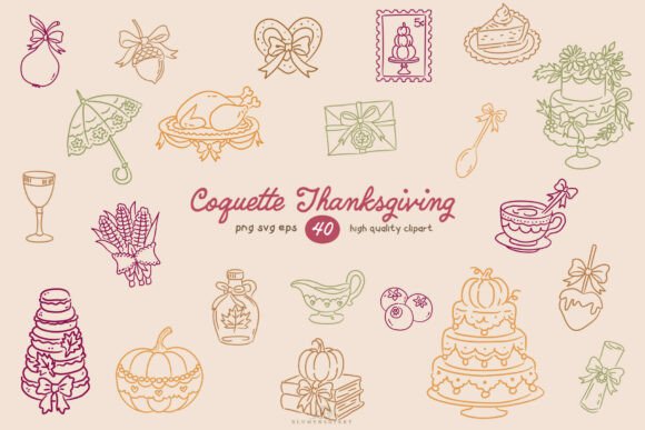
This coquette line art is soft and a little frilly, bows and thin curves, and it fits the spot a bold piece would overwhelm. I had a narrow vertical gap between two larger frames and this slotted in perfectly, tall and slim and quiet. Small frames are where I dump my prettiest, fussiest prints.
The fine lines print beautifully on smooth paper, where any texture would have broken up the delicate strokes. I used a bright white sheet here on purpose so the lines stayed crisp.
Nitpick: those thin lines are unforgiving if your printer is even slightly low on ink, the strokes go patchy and the whole thing looks faded. I ran a nozzle clean before printing this one so it came out solid.
Line-Art Clipart for the Mat I Recut
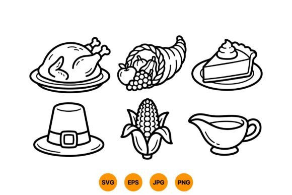
Here is the piece tied to my one mistake. I wanted this line-art clipart floated inside a custom mat with extra wide borders for that gallery look, so I cut a mat board to size. With a dull blade. The edge came out crooked and ragged and you could see every wobble against the print.
I bought a fresh blade the next day, cut a new mat, and the difference was night and day, clean straight edges that made the simple line art look like it belonged in a real frame shop. Lesson logged.
Nitpick: the clipart pieces are sized small, so blowing one up to fill a big mat opening softens the lines a bit. I kept the frame modest so the art stayed sharp instead of fighting the scale.
Tiny Icons for the Cluster of Little Frames
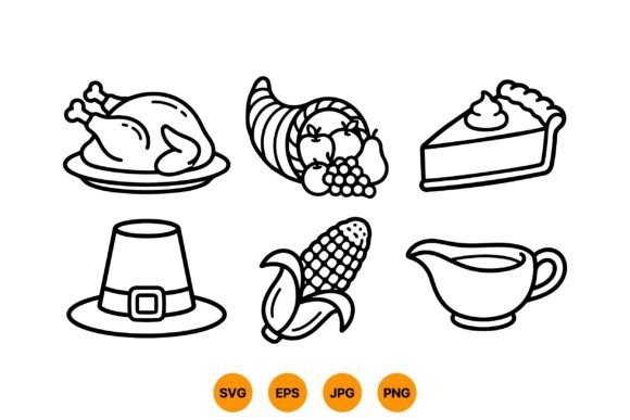
These are small line-art icons, single little symbols, and I treat them like a set, printing several and clustering them in a tight grid of matching mini frames. A 3×3 block of tiny turkeys and pumpkins and corn reads as one piece from across the room and rewards you up close. It fills an awkward square of wall nicely.
I printed each icon centered with generous white space so the frames look uniform, then hung them with a hair more gap than felt natural, which is the spacing that actually looks right.
Nitpick: getting nine little frames hung level is fiddly and this is where the level earned its keep, since my sister’s eyeballing method had the bottom row drifting downhill. I measured. She narrated.
Patchwork Stickers I Framed Instead of Stuck
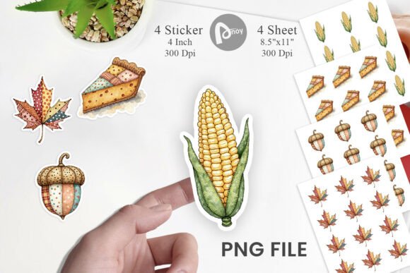
These are technically stickers, patchwork-style Thanksgiving art, but I do not stick them anywhere, I print the sheet and frame the whole arrangement as a single busy, charming print. The quilted look gives a wall some cozy texture next to all the clean line art. It is the warm note in the group.
I laid the sticker sheet into a wide square frame and the patchwork pattern filled the opening edge to edge, no mat needed, which made it the easiest piece on the whole wall to hang.
Nitpick: printed at full sheet size some of the smaller patchwork pieces lose their fine detail, so do not expect crisp tiny stitching. From across the room it reads great, which is where wall art lives anyway.
The Companion Patchwork Sheet for Balance
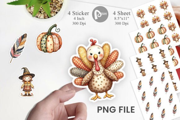
This is the second patchwork sheet and I framed it to mirror the first one on the other end of the gallery, the same way I paired the turkeys. Two patches of warm quilted texture anchoring opposite corners keeps the wall from feeling lopsided toward all the cool line art in the middle.
I used an identical frame to its twin and hung them at matching heights, and the repetition is what pulls the whole eclectic wall together into something that looks deliberate.
Nitpick: it sits very close in style to the first patchwork sheet, close enough that if you only frame one nobody will feel the loss. I doubled up purely for the symmetry, not because the wall needed both.
The Cut File I Used as a Print Anyway
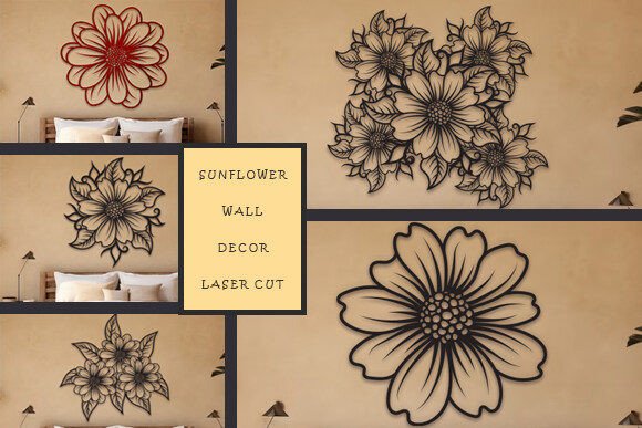
This bundle is built for a laser cutter, sunflower wall art meant to be cut from wood or acrylic, but I do not own a laser and I improvised. I printed the design flat onto heavy cream stock and framed it like any other art, and honestly the layered cut look translated fine as a graphic print. Sunflowers carry past Thanksgiving into the gray of November, which I like.
The bold sunflower shape gave my wall a different texture from all the turkeys and line work, a little break in the theme that keeps the gallery from feeling one-note.
Nitpick: since it is designed as a cut file, the print version has no fine shading, just clean flat shapes, so it looks more graphic than painterly. That suited my wall, but go in knowing it is bold and simple, not soft and detailed.
The Classic Line Set I Closed the Wall With
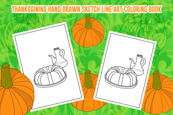
I finished the gallery with this straightforward Thanksgiving line art, the no-nonsense version, clean outlines and classic motifs with nothing trendy about it. After all the coquette frills and folk-art swagger, the wall needed one calm, plain piece to let the eye rest. This was it.
I dropped it into a thin black frame, the most basic one I had, and hung it low in the cluster where a quieter print belongs. It is the comma between the louder pieces.
Nitpick: the style is a little generic on its own, the kind of line art you have seen a hundred times, so it works as a supporting player but I would not make it the star. In the group it pulls its weight; alone it would be forgettable.
Frequently Asked Questions
How to stop posters falling down?
For a real frame I skip the single nail and use a sawtooth hanger or two small D-rings on the back, which spreads the weight and keeps the frame from tilting forward off the wall. A felt bumper on the bottom corners stops it sliding sideways too.
For an unframed print I gave up on tape entirely. Even the good stuff lets go once a room warms up, and I came down one morning to a sunflower print curled on the floor.
How to keep a poster from falling off the wall?
Weight and wall type are the real culprits. On drywall I use a small picture hook with a thin nail rather than a sticky strip, since adhesive loses its grip the moment the heat kicks on for the season.
If you are renting and cannot put nails in, mount the print to a piece of foam board first so it has some rigid body, then use removable strips rated well above the actual weight. Cheating the weight rating is how things end up on the floor.
Can I print these at home?
Yes, every piece on this wall came off my home printer. For framed art I reach for heavier matte stock, 110 lb, because a larger print on thin paper ripples and buckles behind glass and you see it the second the light hits.
The smaller icons and line pieces print fine on lighter paper. Save the heavy stock for anything going into a big frame where flatness matters.
What file formats do these designs come in?
Most arrive as a PDF or PNG you can print straight away, and the line-art and folk pieces here mostly came as PNGs with transparent backgrounds, which means you may want to drop them onto a colored rectangle before printing so they are not floating on white.
The sunflower bundle is the odd one out, built as a cut file, but I printed it flat with no trouble. So even the cut-file format does not lock you out if you only want a print.
Before You Print
Swapping one wall of photos for a gallery of Thanksgiving prints is the most return I get for the least effort all November. Print, frame, hang on the nails that are already there, and the room turns the corner into the season in an afternoon.
Buy the fresh blade before you cut the mat, not after. My crooked first attempt is in the recycling, and my sister will remind you of it if you ask her.