This post contains affiliate links. If you grab one of the printables I recommend, I may earn a small commission at no extra cost to you.
There are two walls in my apartment that defeat me every year. The one going up the stairwell, tall and narrow and impossible to reach the top of. And the one behind my desk in the home office, a flat beige rectangle that stares back at me on every video call. Both of them want something big. Small framed prints just look lonely up there.
So every fall I go hunting for poster-scale autumn art, the kind of file you can blow up to fill a real wall instead of a postcard. Watercolor scenes, a fat seasonal scene with room to breathe, art that holds together when it is two feet wide and you are looking at it from across the room.
Most of these started as files from an indie design shop that I sized up myself. A few of the links below are affiliate links, so if you grab one I might get a small cut, no cost to you. The stairwell finally looks intentional this year, so let me show you what worked.
A playful set I arranged into one big poster

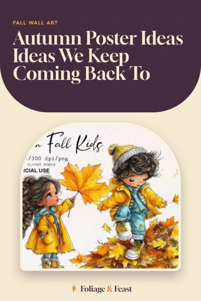
I did not use this as one image. I took the whimsical kid-and-leaves pieces from the set, laid them out in a grid in a free design app, and printed the whole arrangement as one big poster for the stairwell. From the bottom of the stairs it reads as one cheerful autumn scene, and up close it is a dozen little drawings.
The palette is soft, ochre and rust and a little sage, so it does not scream at you the way kid-bright art sometimes does. That mattered for a wall I walk past forty times a day.
The nitpick: arranging it yourself is real work. If you want a finished poster you can just hit print on, this is not that. This is the set for someone willing to fiddle in a layout app for twenty minutes.
The watercolor fence that anchors the stairwell
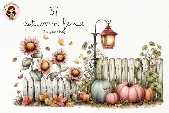
This is the one that finally fixed my stairwell. A long watercolor fence with leaves drifting along it, and because it is horizontal I rotated and stretched it tall, so it climbs the narrow wall the way the staircase does. It looks like it was made for that exact spot. It was not, I just got lucky with the proportions.
Watercolor scales up beautifully, the soft edges stay soft instead of going pixelated, so even printed big it reads as a real painting from a few feet back.
My nitpick: because it is a PNG with a transparent background, I had to put a paper-colored backing behind it or the fence floated on the wall with no ground. I printed it onto warm cream stock instead of bright white and that grounded it.
Fuzzy sheep for the small landing where the stairwell turns
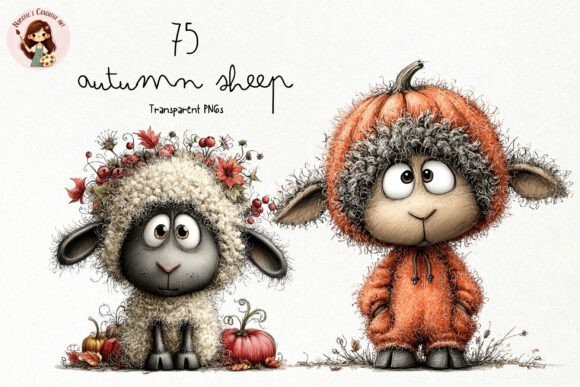
There is a little square landing halfway up where the stairs turn, and a giant poster would be too much there. So this got the sheep. I printed one fuzzy sheep big, just one, on a single sheet, and it sits at eye level on that landing like a friendly little surprise.
The texture on the wool is the whole charm. Printed at a decent size you can see the fuzz, and it holds up; it does not turn into a gray blob the way some clipart does when you enlarge it.
Nitpick: it is very cute, almost greeting-card cute, so it would fight a more serious art wall. On a tiny stair landing it is perfect. In the office it would have looked out of place.
A harvest mouse for the gap beside the office door
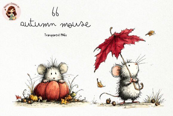
My desk wall had one awkward skinny strip beside the door frame, too narrow for anything big. The harvest mouse, the little one clutching a wheat stalk, filled it exactly. Printed tall and thin, it turned a dead sliver of wall into a deliberate choice.
The detail is fine enough that it rewards a close look, which is good because you stand right next to it coming through the door. The wheat is delicate without getting muddy.
The gripe: those thin wheat stalks are the first thing to suffer if your printer is even slightly low on ink, they go ghostly and break up. I ran a nozzle check before printing this one, which is not advice I usually follow until something goes wrong.
The moose bundle that became the office statement piece

The big beige wall behind my desk needed one bold thing, and the moose did it. I picked the largest, simplest moose in the bundle, blew it up to a true poster size, and now it is the first thing anyone sees on a video call. People comment on the moose. The moose has fans.
A bundle is the right move for a statement wall because you can try a few and see which silhouette holds at scale. Busy ones get noisy when they are two feet tall; the clean one stays strong.
Nitpick: the bundle is large and a couple of the moose are nearly identical, so I clicked through more files than I expected to find the one with the cleanest antlers. Worth it, but set aside a few minutes to sort.
The autumn girl I tiled across four sheets

This is the one I went too big on. I loved one of the autumn girl illustrations and decided it should be a proper poster over the office sofa, bigger than my printer could handle on a single page. So I tiled it, split the image across four sheets, printed each, and lined up the seams by hand with a metal ruler and a lot of patience. Two seams are perfect. One you can find if you know to look.
Tiled big, the illustration absolutely earns the wall, the warm rust and gold fill the whole space above the couch.
The nitpick is the tiling itself, not the file: a hairline white edge wants to show at every seam, so I trimmed the borders off three of the four sheets before taping. Do that and the joins nearly vanish.
A teddy bear print for the cozy office corner

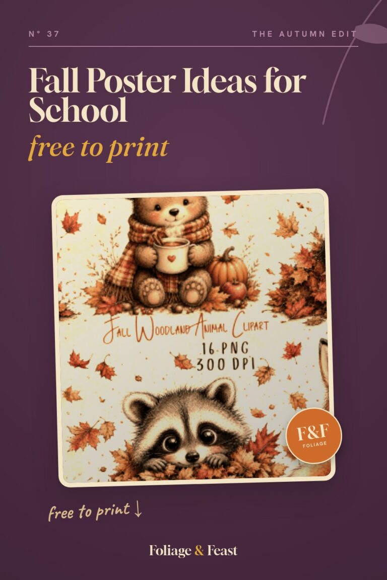
Not every wall in the office needed to be a statement. The corner by my reading chair wanted something softer, and the whimsical teddy bear, in its little autumn scarf, did the job at a modest size. It is the warm, low-key print you do not really notice until you are sitting right under it with a coffee.
It is a PNG, so I matted it on a square of kraft-colored paper and popped it in a frame I already owned, which made it look more finished than the file alone.
My nitpick: the bear is pretty small in the original framing, lots of empty space around it, so when I enlarged it the bear got grainy before the poster got big. I kept this one small and let it stay a sweet little corner piece instead.
The watercolor cat my roommate claimed immediately
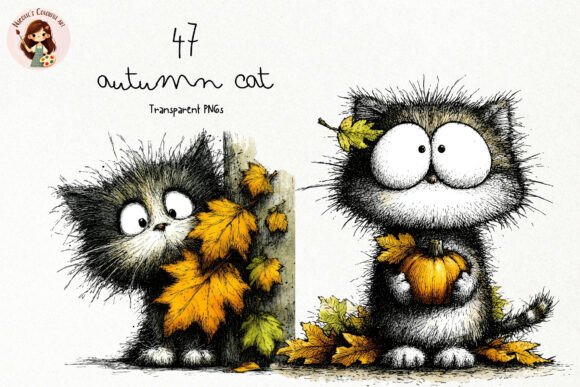
I printed this one for the stairwell and my roommate intercepted it before it ever made it to the wall. A loose watercolor cat in autumn tones, and she decided it belonged in the entryway by her shoes, so that is where it lives now. I have given up trying to get it back.
Like the fence, the watercolor scales up cleanly, so even at a decent poster size the brushy edges stay painterly instead of crunchy.
Nitpick: the colors run a little cool, more dusty mauve than warm rust, so it did not match the ochre-heavy stairwell anyway. It suits the entryway better. My roommate was right, which I will deny if asked.
Seamless patterns for the wall-filling background trick
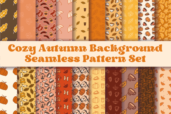
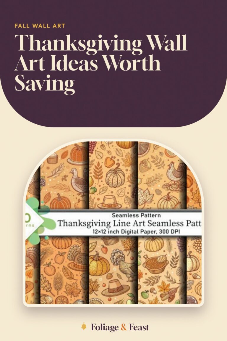
This set is sneaky useful for big walls. Because the patterns tile seamlessly, I printed one across two sheets, lined up the repeat, and made a wide background strip to sit behind a couple of smaller framed prints on the office wall. Suddenly the little frames looked grouped on purpose instead of scattered.
The repeating leaves and acorns are subtle enough to sit behind other art without competing, which is exactly what you want from a background.
The gripe: lining up a seamless repeat across two printed sheets takes a steady hand, the pattern has to match exactly at the seam or your eye catches it instantly. I taped from behind and checked the alignment three times before I committed.
The whimsical girls set for a gallery of mid-size prints

After the giant tiled poster, I wanted some calmer mid-size prints to balance the office, and this set gave me three. I printed three of the whimsical fall girls at the same modest size, framed them in matching frames, and hung them in a row down the wall by the window. A little gallery, no tiling, no drama.
Keeping them the same size and frame is what made it read as a set instead of clutter. The shared palette did the rest.
Nitpick: the figures sit a bit off-center in a couple of the files, so when I framed them straight, one girl looked like she was drifting toward the edge. I nudged that one in the layout app before printing so all three matched.
Frequently Asked Questions
How to stop posters falling down?
My big tiled poster kept peeling at the corners until I stopped trusting plain tape. Now I use a strip of removable mounting putty at each corner plus a couple of mounting strips along the top edge, which spreads the weight so no single point pulls loose. A poster that wide sags in the middle if you only stick the corners, so I add a putty dot halfway down each side too.
For the heavier cardstock prints I switched to thin double-sided foam squares, which hold a surprising amount and pull off the wall cleanly later.
How to keep a poster from falling off the wall?
The real culprit at my place was the wall texture and the season. On a slightly bumpy painted wall, tape only grabs the high spots, so I wipe the wall down first to get the dust off, let it dry, then press the mounting strips on hard for a full thirty seconds. Pressing properly is half the battle and the step everyone skips.
If it is a big poster on a humid wall, foam mounting squares beat tape every time. Tape lets go when the air gets damp; the foam squares have held my office moose through a whole season.
Can I print these at home?
Yes, with one honest caveat: a home printer maxes out at letter size, so a true poster means either sending the file to a print shop or tiling it across sheets yourself like I did with the autumn girl. Tiling is free and works, you just trim the white edges and line up the seams.
The smaller and mid-size prints, the sheep, the mouse, the framed girls, all print fine at home on one sheet. For those I use a heavier 110 lb stock so they sit flat in a frame and do not ripple.
What file formats do these designs come in?
Most of these arrive as high-resolution PNG images with a transparent background, which is what lets you size them up to poster scale and drop them onto a colored backing without an ugly white box around them. The seamless pattern set is also image-based, built to repeat without a visible seam.
Because they are PNGs, you open them in any photo or design app to resize, then print. For the big ones I set the print to tile across multiple pages, and that is the whole trick to going poster-size at home.
Before You Print
The lesson I keep relearning is to measure the wall before I fall in love with a file. The autumn girl was bigger than my printer, so I tiled her across four sheets and spent an evening lining up seams with a ruler, and she looks great, but I could have just sent that one file to a print shop and saved myself the taping.
So: figure out which walls want a single statement and which want a row of mid-size frames, blow up the watercolors because they scale clean, and keep some mounting putty handy for the corners. My stairwell is finally done, and my roommate still has my cat print.