This post contains affiliate links. If you grab one of the printables I recommend, I may earn a small commission at no extra cost to you.
My hallway is a dead zone. Long, narrow, one sad light fixture, and for eleven months it holds nothing but a coat hook and a smudge from where somebody’s backpack keeps hitting the wall. Then October shows up and I decide it needs pumpkins. A whole row of them, frames staggered so your eye walks down the wall the way it walks down the hall.
My neighbor came over to borrow my printer last week and stopped halfway down to ask where I bought them. I did not buy them. I printed them, the same way she was about to print her kid’s field trip form, except mine were pumpkins and I had spent an embarrassing amount of time picking the right ones. She thought they came from a store. They came from a folder on my laptop.
What I learned the hard way: the file is only half the job, the paper is the other half. My first round printed orange and came out the color of weak tea on the bargain copy paper I had loafing in the tray. I switched to a heavier matte stock and the rust came back to life. A few of the files below are ones I actually used, and yes, some of the links are affiliate links, so if you grab one I get a tiny cut. Costs you nothing. Here they are.
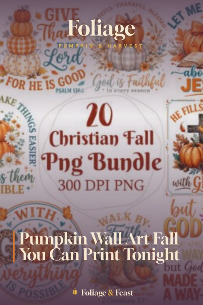
A Pumpkin Bundle With Scripture Woven In
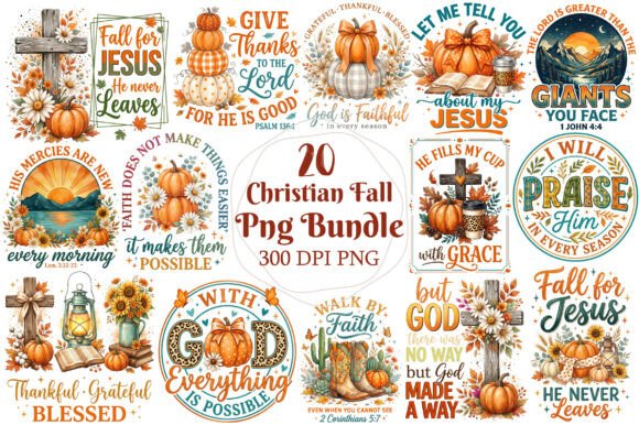
This one is a bundle, which sounds like overkill until you are standing in a hallway with eight empty frames and no idea what goes where. I pulled three pumpkins and one of the verse designs out of it and the set already looked like I had a plan.
The Christian pieces I leaned toward the end of the row, closer to the kitchen where people actually pause. Soft amber tones, a verse tucked under the stem on one of them. I printed it at 8×10 and dropped it into a thrifted frame that cost a dollar fifty.
My one gripe: the bundle gives you so many PNGs that I sat there for twenty minutes second-guessing which four to use. Pick fast or you lose the evening to it.
Tiny Labels That Punch Above Their Size
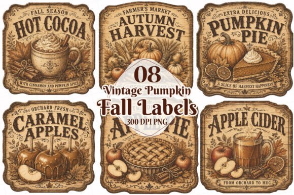
Labels feel like a strange thing to hang on a wall, and then you size them up and they read like little vintage botanical prints. That is exactly what I did with these. Bumped the scale way past sticker size and framed two of them as a pair.
The faded-poster look on these did something my glossier pumpkins could not. They felt old, like they came out of somebody’s grandmother’s pantry. I put the pair right by the light switch so they get caught every time you flick it on.
Nitpick: a couple of the labels have blank space built in for text. Pretty on screen, a little empty on the wall if you do not fill them. I scribbled a date on one by hand and left the other one bare on purpose.
The Otter Nobody Expected To Love
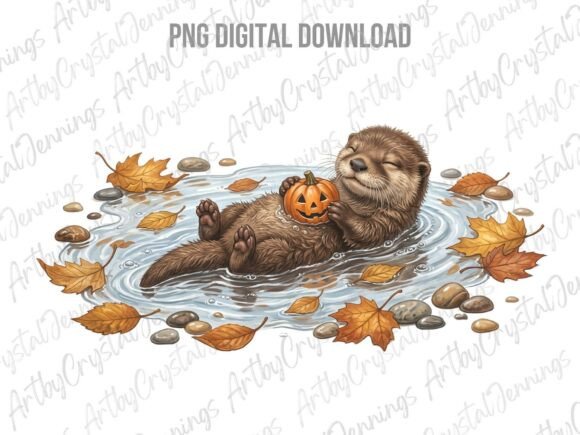
I added this on a whim and it became the piece my neighbor pointed at. An otter holding a pumpkin. It has no business being as charming as it is, but a hallway full of serious harvest art needs one thing that makes you smile.
I printed it smaller than the rest, maybe 5×7, and hung it low, around kid eye level, so the little ones who come through have something at their height. It breaks up the grown-up tones with something soft.
One flaw: the otter’s outline is fine and a touch delicate, so on that first wimpy paper it almost vanished into the background. On the matte stock the linework finally held its edges.
Florals And A Pumpkin, Built For Bigger Prints
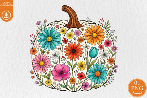
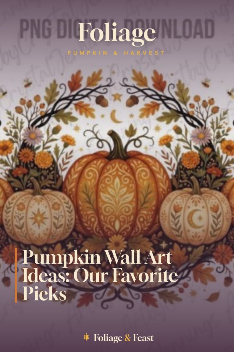
This is sold as a sublimation file, which is a fancy way of saying it is high resolution and does not fall apart when you blow it up. That mattered to me because the wall at the end of the hall wanted one bigger anchor piece, not another small frame.
I ran it at 11×14, the largest my home printer handles in two passes, and the florals around the pumpkin stayed crisp. Rust and a little ochre in the petals, which tied the whole row together better than I planned.
The catch: at that size you really see the paper. On anything thin it buckled and waved in the frame. The heavier matte stock laid flat and that was the end of that problem.
Folk-Art Pumpkins With A Hand-Painted Feel
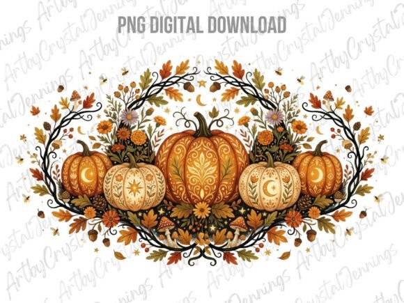
Folk art is my soft spot. These have that slightly wonky, painted-by-a-person look, where the lines are not machine-perfect and the pumpkins lean a little. On a wall of crisp printables they read like the real handmade thing in the bunch.
I grouped two of them together in matching frames so the folk style had a partner and did not look like an accident. They sit in the middle of the hallway where the light is worst, and honestly the painterly texture survives bad lighting better than the photo-real files do.
Quibble: the color palette runs a touch dark, so on a dim wall they can disappear. I cheated by putting them next to a paler label print to make them pop.
A Bow-Topped Pumpkin For The Soft Corner
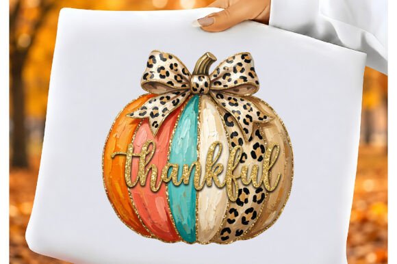
The coquette style is all ribbons and little bows, and I almost skipped it because my hallway is not exactly a frilly place. Then I printed one and stuck it by the mirror near the front of the hall, and it turned out the soft girly note was exactly what that spot wanted.
The word thankful sits across this one, so it does double duty as decor and a quiet little reminder you catch on the way out the door. I printed it on the matte stock at 8×10 and the bow detail came through clean.
One note: the pale pink in the design needs a bright wall behind it or it washes out. Against my off-white hallway it was fine. Against a darker paint it might fade into nothing.
Loose Brushstrokes That Read As A Real Patch
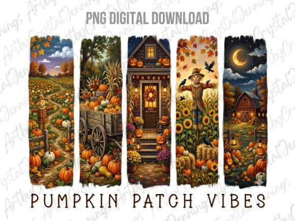
These have visible brushstrokes, the kind where you can almost feel the paint being dragged across the pumpkin. Up close it is loose and a little messy. Step back six feet in the hallway and it reads as a whole little patch of them.
I used one large brushstroke print as a second anchor near the coat hook, the busiest spot, because the loose style hides scuffs and fingerprints better than a clean graphic would. Practical decorating, my favorite kind.
The nitpick: the brushy edges can look slightly fuzzy if you print too small, like the file is out of focus. Keep it at 8×10 or larger and the texture reads as intentional instead of blurry.
The Second Coquette Pumpkin, Pared Back
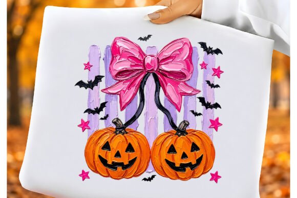
Yes, a second coquette pumpkin, and no, they are not the same. This one is quieter, less bow and more pumpkin, which made it the better pick for spots where I wanted soft but not sweet.
I hung it across from the first coquette print so the two of them have a conversation down the hall instead of crowding one wall. Same gentle palette, different weight. Together they bookend the frilly part of the row.
My one complaint: it is close enough to the other coquette file that if you hang them side by side it looks repetitive. Spread them out. Mine are a good ten feet apart and they each get to breathe.
A Scarecrow To Anchor The Far End

A scarecrow standing with a pumpkin gives the row a character to end on, like the whole hallway was building up to him. I put this one at the very end, the last frame before the kitchen doorway, so he sends you off.
The style is cute and rounded, friendly rather than the spooky scarecrow thing, which fits a hallway people walk through all day. I printed him at 8×10 and the straw texture on his hat held up nicely on the matte stock.
One flaw: he has a lot of small details, the straw, the stitching, the patches, and on cheaper paper they muddied together into one brown blob. The better stock kept the little bits separate and legible.
The Classic Patch That Started The Whole Wall
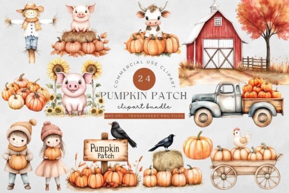
This was the first file I bought, the one that made me think the hallway could become a thing at all. A straightforward pumpkin patch scene, no gimmick, just pumpkins done well. It set the tone for everything I added after.
I gave it the prime spot, dead center at eye level where you land when you first walk in. Everything else on the wall orbits this one. Classic rust and orange, the colors that made me obsess over paper in the first place.
The nitpick: it is an older file and the resolution is a hair softer than the newer ones, so I would not push it past 8×10. At that size it is sharp. Any bigger and the edges start to feel a touch soft.
Frequently Asked Questions
Where to find harvest festival decorations sims 4?
Ha, different kind of pumpkin patch. For Sims 4 harvest festival decor you want custom content sites like The Sims Resource or Patreon creator pages, not printable files. The pumpkins on this page are made to come out of a real printer and hang on a real wall, not a virtual one.
If you landed here looking for the game, no hard feelings. But if you have a blank hallway in the actual world, the files above will fill it for the price of paper and ink.
Can I print these at home?
That is the whole point. Every file here came off my home printer, a tired inkjet that complains constantly. The only thing I would push you on is paper. Skip the bargain copy stock, which is where my first orange pumpkins went brown and sad, and use a heavier matte sheet instead.
If your printer is really on its last legs, the library or a copy shop will run them on better paper for pocket change. I have done the library run more than once.
What file formats do these designs come in?
Most of these arrive as PNG files, which is what you want for wall art because they print clean and some come with transparent backgrounds. The labels and bundles may include a few extra formats inside the download.
You open them like any image and send them to print. No special software needed for the hanging-on-the-wall use I am describing here.
Do I need a Cricut or Silhouette to use these?
No. A cutting machine is for vinyl and stickers and that whole world. For framing pumpkins on a hallway wall you need a printer, paper, and frames you probably already own or can thrift for a dollar.
If you happen to own a Cricut, you could use some of these for other projects, but nothing on this page requires one. I do not own a single cutting machine and my hallway turned out fine.
Before You Print
The wall took me one evening, two if you count the night I wasted printing everything in weak-tea brown before I fixed the paper. My neighbor still thinks I bought the pumpkins somewhere fancy, and I have not corrected her, because watching her walk slower down a hallway she has passed a hundred times is its own small reward.
Start with one anchor pumpkin in the spot people see first. Print it on real matte stock, not whatever is loafing in your tray. Then add the otter, because somebody needs to smile on the way to the kitchen.