This post contains affiliate links. If you grab one of the printables I recommend, I may earn a small commission at no extra cost to you.
My neighbor decorates like the season is a competitive sport. By the second week of September her porch has hay bales, three sizes of pumpkin, and a banner that says something seasonal in a font I cannot place. I am not like that. I do one good wall, maybe a mantel, and I let a couple of printed pumpkins do the heavy lifting while she handles the spectacle next door.
The trick I keep coming back to is orange against sage. Not the loud orange you get on a bag of candy, the softer one, sitting next to a dull green that reads almost gray in the afternoon. A printed pumpkin in those two colors on heavy paper, propped where the light hits it, and the room is done. No haul, no storage bins in the garage.
A quick word before the list. I print most of these at home and grab the rest from an indie design shop, and a few of the links below are affiliate links, so if you buy through one I get a tiny cut. Costs you nothing. Now the pumpkins.
A Wreath That Lives on the Wall, Not the Door
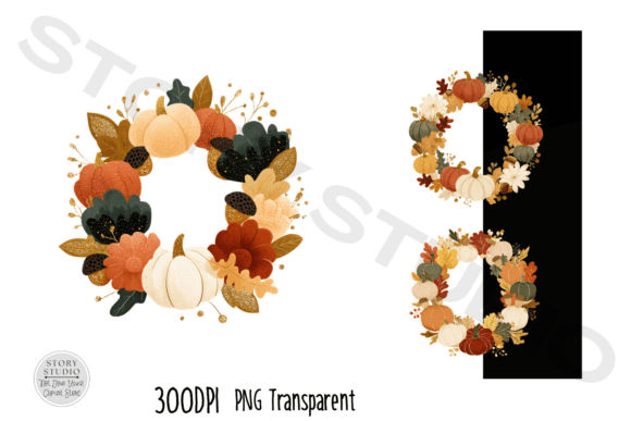
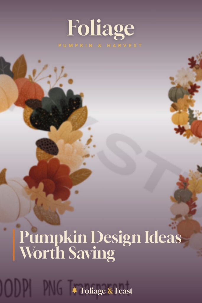
This one is a full harvest wreath built around pumpkins, and I never hung it on a door. I printed it large, framed it cheap, and leaned it on the mantel where the candle glow catches the orange. From the couch it reads like a real wreath someone wove, which is the whole joke, because I just sized a file and clicked print.
The sage and rust tones in it are the reason I grabbed it over the louder fall art floating around. It sits next to a green vase I already own and looks like I planned the palette. I did not plan anything.
One nitpick. This is the file that ate my ink. I sent it at full saturation the first time and the orange came out so dense the paper buckled and my cartridge was gasping by the second copy. I dropped it to a lighter draft setting and it printed fine, a little softer, honestly better for the sage-and-orange thing I was going for.
A Cut-File Pumpkin With Maple Leaves Stacked On Top
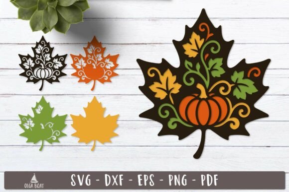
Layered cut files are a different animal from the flat prints. This one stacks a pumpkin shape with maple leaves on top, so you build up little shadows as the layers go down. I ran it in cardstock, three weights of orange, and the leaves caught the light along their edges.
I propped the finished one on the mantel next to the framed wreath, and the depth made the flat prints look even flatter, in a good way. My neighbor asked where I bought it. I bought a file.
Nitpick: the maple leaf layer has thin little stem points that lift and curl if your cardstock is too light. I switched to 110 lb for the top layer and weighed it under a book overnight and the stems stayed put.
The Floral Pumpkin That Hides Its Seams
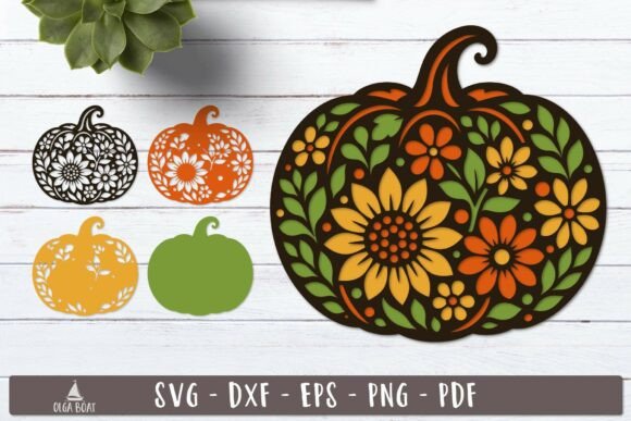
Same layered idea, but the top is flowers tucked into the pumpkin instead of leaves. I leaned sage on this one, green paper for the floral layer over an orange base, and it ended up the calmest piece on the whole mantel.
It sat to the left of the maple version and the two of them read like a little set, even though I cut them weeks apart. If you only want one layered pumpkin, I would pick this floral one, because the petals forgive a slightly wobbly cut better than crisp leaf points do.
Nitpick: there are a lot of small floral pieces, and gluing them is fiddly work for a weeknight. I spread it across two evenings and used a toothpick for the glue instead of squeezing it straight from the bottle, which saved me from the glob marks I got on my first try.
Three Pumpkins Stacked Like a Little Tower
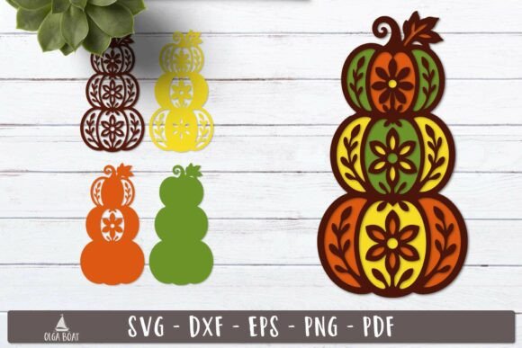
This is the stacked-pumpkin tower, three of them piled up, and it is the one that anchors the right side of my mantel. Cut in graduated oranges from the deep one on the bottom to the pale one on top, it has a height to it that the single pumpkins do not.
I set it where the eye lands first when you walk in, and it does the job of a real pumpkin display without me hauling actual gourds that go soft by November. The sage runs in as the little stems and a leaf or two between the layers.
Nitpick: a tall stack is top-heavy and mine tipped twice before I figured it out. I cut a small square of the leftover cardstock and tucked it under the back as a kickstand, and it has stood straight since.
Plain Line-Art Pumpkin That Punches Above Its Weight
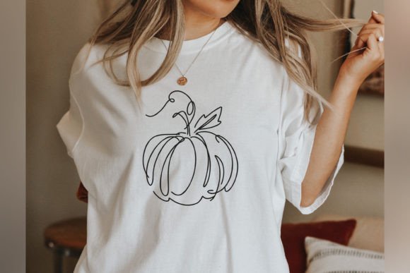
This started as a shirt design, just a single-color line drawing of a pumpkin, and I almost scrolled past it. Then I printed it in sage on cream paper, slim black frame, and it became the quiet one I keep next to the window.
Line art is the easiest thing in the world to print at home because there is barely any ink involved, which after the wreath disaster felt like a relief. One outline, one color, done in seconds.
Nitpick: blown up too large the thin lines start to look fragile and a little empty on the page. I kept mine at 8×10 and it held together, but I would not push it to poster size without thickening the stroke first.
Pumpkin Spice Lettering for the Kitchen Window
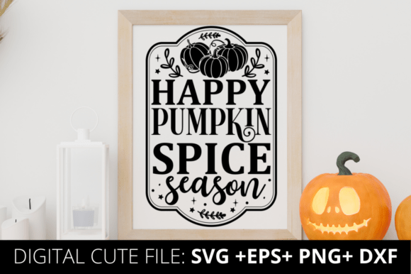
This is the cheery ‘happy pumpkin spice season’ lettering, and it lives in my kitchen, not the front of the house. I printed it small, propped it against the backsplash behind the kettle, and it is the first thing I see when the coffee is brewing.
The lettering carries the orange well without needing much paper, so it is a cheap one to run. I did mine in the soft orange to keep it from clashing with the sage towels.
Nitpick: the design leans wide, so if you frame it in a tall portrait frame you get awkward space top and bottom. A landscape frame or no frame at all suits it better, and I went frameless with a little easel stand.
The Same Slogan in a Different Hand
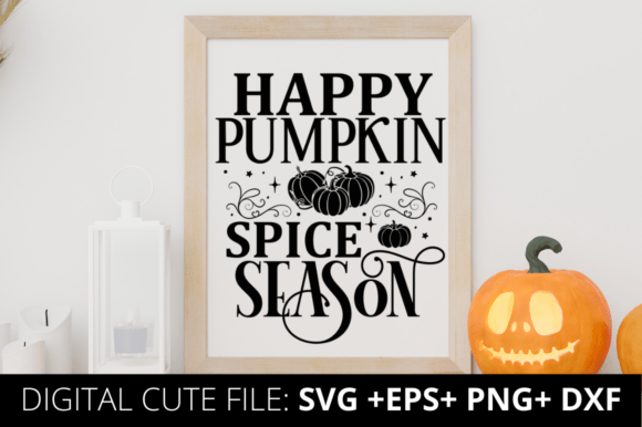
This is a second take on the pumpkin spice line, drawn in a different lettering style, and I will be honest, I bought both before I realized how close they were. I gave this one to my over-decorating neighbor and she put it on her porch immediately, which is exactly where it belongs.
It is bolder than its twin, so it holds up outdoors behind glass where a finer print would get lost. If you only want the slogan once, pick by weight: this one for a busy porch, the other for a quiet kitchen.
Nitpick: the bolder strokes drink more ink than the lighter version, so I ran this one on the draft setting too after my wreath lesson. Came out fine and saved the cartridge.
A Thankful-Teacher Pumpkin for the Gift Pile
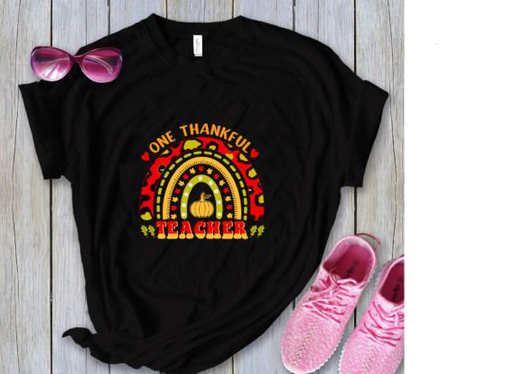
This pumpkin reads ‘one thankful teacher,’ and it is the odd one out on my list because it is not for my walls at all. I printed it, slid it into a flat frame, and it went to my kid’s teacher in November with a bag of coffee.
It works as wall art for someone who teaches, but I have mostly used it as a quick, warm gift that looks like I put thought in. The pumpkin keeps it from feeling like a generic card.
Nitpick: the wording is fixed, so if your giftee is not a teacher this one does nothing for you. I wish it came with a blank version of the same pumpkin, because the art itself is lovely and I would reuse it.
A Hello-Pumpkin Print for the Entry Wall
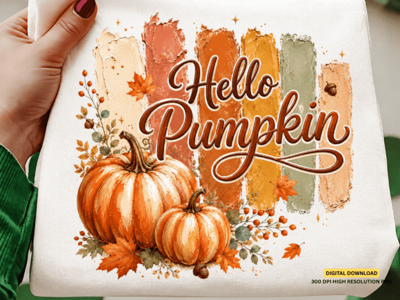
This ‘hello pumpkin’ design is a flat PNG, no cutting, no layers, and it is the most forgiving file here. I printed it for the little wall right inside the door so it is the first orange thing anyone sees coming in.
Because it is a single image you just size it and go. I did mine at 11×14, sage mat, and it greets people before they even get their coat off.
Nitpick: a PNG can come through with a hard white box around the art if your printer does not handle the edges well, and mine left a faint border the first run. I trimmed the white off by hand with a ruler and a craft knife and it looked intentional after.
A Pumpkin-and-Flowers Print to Close the Set
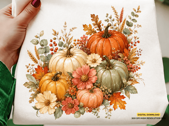
Last one, and it ties the mantel back together: a pumpkin with a floral arrangement spilling out of it, flat print, heavy on both the orange and the sage. It hangs at the far end as a bookend to the wreath at the other.
I like that the flowers pull the green up into the artwork so the sage in my vases and towels does not feel like an accident. It is the piece that makes the whole wall look like one idea instead of nine separate pumpkins.
Nitpick: it is the most color-dense print of the flat ones, so after the ink scare I tested a single page on the lighter draft setting first before committing. The lighter pass actually suited the muted palette, so that is how I left it.
Frequently Asked Questions
Where to find harvest festival decorations sims 4?
That one is a different rabbit hole than this list. The Sims 4 harvest decor lives in the game’s seasonal content and in custom-content sites the Sims community runs, not in printable files like the pumpkins here.
If you landed here looking for real paper you can hang on a real wall, you are in the right place. If you want pixels for your virtual porch, you will want a Sims CC site instead.
Can I print these at home?
Yes, and that is mostly how I do it. A regular home inkjet handles the flat prints and the line art without a fuss, and cardstock for the layered ones runs fine through most printers if you feed it one sheet at a time.
The one caution, and I learned it on the wreath, is saturation. A very dense orange at full quality can soak the paper and drain a cartridge fast. Drop to a lighter or draft setting and you save ink and the page lies flatter anyway.
What file formats do these designs come in?
It depends on the piece. The flat art tends to come as PNG or PDF you can send straight to a printer, while the stacked and floral pumpkins come as cut files meant for layering.
I check the listing before I buy so I know which kind I am getting. A flat print and a layered cut file are two very different evenings of work.
Do I need a Cricut or Silhouette to use these?
For the flat prints, no. You print them and frame them, that is the whole process, no machine involved.
For the 3D layered pumpkins, a cutting machine makes life much easier because the layers have a lot of small pieces. You can cut them by hand with a craft knife if you are patient, and I have done it on the simpler ones, but the floral layers especially are slow going without a Cricut or Silhouette.
Before You Print
So that is my wall: a printed wreath, two layered pumpkins, a stack, a couple of slogans, and the flat prints that fill the gaps, all of it orange and sage and most of it run off my own printer. My neighbor still wins on volume. She has the hay bales and the three-foot inflatable and I am never going to catch her there.
But I get the same warm look for a fraction of the haul, and when December comes I do not have a garage full of bins, just a folder of files waiting for next fall. Start with one layered pumpkin and one flat print, keep the saturation low, and see how far two colors carry you.