This post contains affiliate links. If you grab one of the printables I recommend, I may earn a small commission at no extra cost to you.
My stairwell wall stayed empty for two whole autumns. I kept telling myself I would get to it. Then one October I printed three leaf designs on the heavy cardstock, hung them in a crooked little column up the stairs, and suddenly the whole landing felt like fall lived there.
The office nook came next. It is the dead corner behind my desk where nobody looks, and I gave it a single ochre leaf print and an olive one, and now it is the spot I stare at on long afternoons. None of this cost much. A few files, paper I already had, frames from the back of a closet.
Most of what is below I printed and hung myself, and a handful of the links are affiliate links, so if you grab one I get a small cut. Costs you nothing. Let us get into the leaves.
Thin Line Leaves for the Office Nook
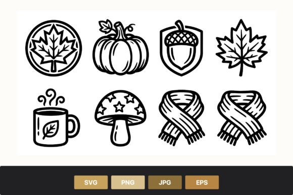
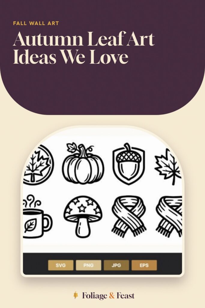
These are skinny single-line drawings, a pumpkin, a scarf, a leaf, the kind of art that does not shout. I printed two of them small and tucked them into the office nook behind my desk, and they read as calm instead of busy. Black line on cream paper, nothing more.
I matted mine in olive and it pulled the whole corner together. The line is fine enough that you want a printer that is behaving, because my tired inkjet skipped a hair of the scarf outline on the first pass and I had to run it twice.
One nitpick: the icons are spaced apart in the original layout, so if you want them as separate little prints you will be cropping each one yourself. I did. Took ten minutes and a steady hand.
The Stitched Maple That Looks Like Embroidery
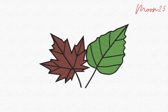
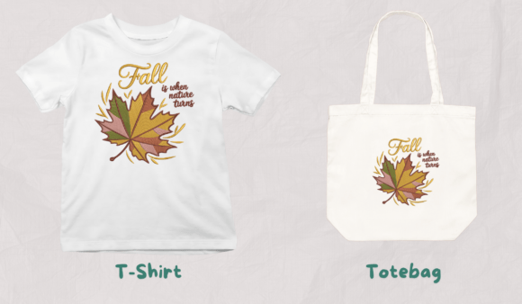
This one fakes the look of thread, a maple and a green leaf done in a stitch style, and printed flat it still tricks people into leaning in to check if it is real embroidery. My grandmother actually reached out and touched the glass to be sure. That was the best review I could ask for.
I hung it in the office nook beside the line-art pair, and the green leaf in it gave me an excuse to lean olive across the whole corner. On 110 lb paper the stitch texture holds up; on thinner stock it flattens into mush.
Nitpick: the green sits cool, almost minty in spots, so if your wall runs warm it can clash a little. I let the olive mat bridge it and stopped worrying.
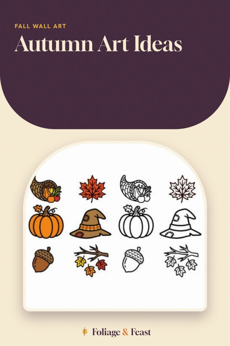
A Whole Harvest Set You Can Size However You Want
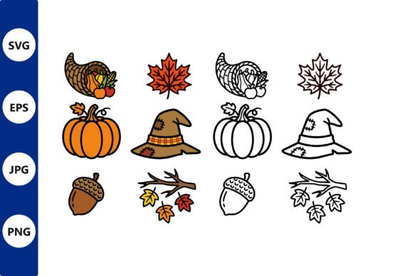
Here you get the full spread, pumpkins, wheat, gourds, leaves, all in clean vector lines you can blow up big or shrink down without it going fuzzy. I printed one large for the stairwell and a tiny version for the nook from the same files, and both stayed crisp.
My best friend helped me pick which icons to feature, and we ended up cutting a single wheat sprig out and printing it huge in golden ochre. It anchors the middle of my stairwell column now.
Nitpick: there are a lot of icons crammed on the master sheet, and the first time I opened it I felt a little lost about what to print first. Start with one shape, get it on the wall, then add.
Outline Harvest Icons for a Quieter Wall
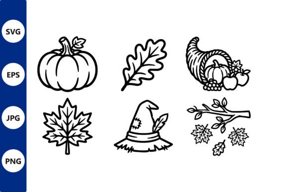
This is the line-only cousin of the harvest set, all outline, no fill, which I love for a wall that already has a lot going on. The empty space inside each shape keeps the stairwell from feeling heavy as the column grows.
I printed three of these in a row up the stairs and left them black on white, no color at all, and that restraint is what makes the ochre wheat print next to them pop. My grandmother said it looked like a sketchbook page, which I took as a compliment.
Nitpick: with no fill, any printer streak shows instantly. I had one faint band across a gourd and you could see it from the bottom step, so I reprinted. Check before you frame.
A Leaf Wreath That Frames the Top of the Stairs
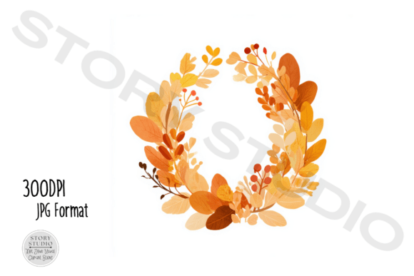
A round wreath of fall leaves, and I printed the biggest one to cap off the top of my stairwell gallery, sitting above the column like a full stop. The circle shape gives the eye somewhere to land after all the rectangles below it.
I went golden ochre on the leaves and it glows in the afternoon when the upstairs window catches it. My best friend has the same set and did hers in rust, and honestly both work, which surprised me.
Nitpick: the leaves overlap a lot in the center, so on a small print the middle turns into a blob. Print it large or not at all. Mine is the biggest thing on the wall and that is on purpose.
The Embroidery Bundle I Printed Instead of Stitched
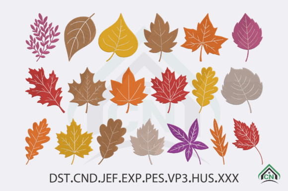
Yes, this is meant for an embroidery machine, but I do not own one, so I printed the preview art flat and framed it. Half the bundle reads beautifully as wall prints, the leaves especially, with that dense thread look baked in.
I put two small ones in the office nook in olive frames and they hold their own next to the real stitch-style print. My grandmother, who actually stitches, gave me a look, but she admitted the printed versions hung straighter than her hoops ever do.
Nitpick: a couple of designs in the bundle are clearly built for thread and look thin printed flat, so you will be picking and choosing. I used maybe four of the dozen. The leaf ones earned their frames.
A Faded Vintage Leaf Print for the Old Frames
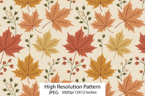
This has that washed-out botanical look, muted leaves on an aged background, the kind of thing that looks like it came out of a flea market drawer. It went into the stairwell next to the brighter ochre prints and gave the column some age.
I printed it on matte paper because gloss killed the vintage feel, and the olive tones in the pattern sat perfectly inside an old wooden frame I had been hoarding. My best friend assumed I bought it at an antique shop.
Nitpick: the muted palette is lovely on screen but goes even paler in print, so on a bright wall it can wash out completely. I moved mine to a shadier stretch of the stairs and it came alive.
One Single Leaf, Front and Center
Sometimes you just want one leaf, big and simple, and that is this. I printed it large, golden ochre, and hung it solo in the office nook before I built anything else around it. For a week it was the only art back there and it was enough.
The shape is bold and reads from across the room, which is exactly what a dead corner needs. My grandmother pointed at it from the doorway and asked where I got the painting. It is a printed file. I did not correct her fast enough.
Nitpick: it is so simple that any color shift is obvious, and my first print came out more mustard than ochre because my amber cartridge was low. Fresh ink fixed it. Check your color before you commit the big sheet.
The Leafy Letters I Used for a Header Print
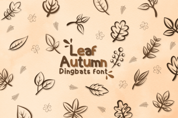
This one is a font, leafy autumn lettering, and I used it to print the word FALL across one wide sheet for the bottom of the stairwell column. Letters made of leaves, which sounds like a lot, but at a small size it reads clean.
I matched the letter color to my golden ochre prints above it so the whole column felt like one idea. My best friend typed her kids’ names in the same font and framed those for their room, which I am stealing next year.
Nitpick: at large sizes the leafy detail inside each letter gets noisy and hard to read, so keep your word short and your print modest. FALL worked. AUTUMN HARVEST would have been a mess.
Soft Watercolor Leaves to Warm the Whole Wall
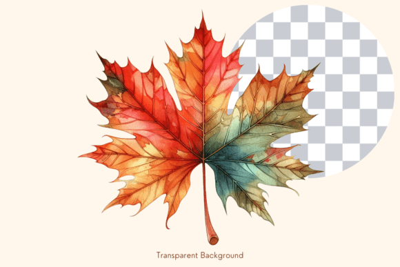
Loose watercolor leaves with bleeding edges, the softest thing in this whole roundup, and the print that finally tied my stairwell column together. The gentle wash takes the hard edge off all the line art around it.
I printed a few at different sizes and scattered them between the bolder prints, leaning into golden ochre and a little olive where the greens showed. My grandmother said this was the one that looked the most like fall to her, and she is hard to please.
Nitpick: I learned this one the hard way. I matted a watercolor leaf in a cool grey first and it looked dead, completely wrong against the warm washes. Redid it in a warm cream mat and it finally breathed. Match the mat to the paint, not the wall.
Frequently Asked Questions
How to stop posters falling down?
My stairwell prints kept sliding because I trusted those little foam squares and the wall was a touch dusty. Wipe the spot first, let it dry, then press the mounting strip on hard for a full thirty seconds. The pressing is the part everyone skips.
For anything bigger than a sheet of paper I went to small nails or proper frame hooks. Adhesive alone gave up on my heaviest wreath print within a week.
How to keep a poster from falling off the wall?
Frame it. A light frame spreads the weight and gives you a hook to hang from instead of asking a sticky square to hold paper to a wall forever. My office nook prints have not budged since I framed them.
If you want it frameless, painter’s tape on the back corners plus a strip of mounting tape in the middle held my flat prints far better than tape alone. The middle strip stops the curl that starts the fall.
Can I print these at home?
That is the whole point, and it is how I made every wall in this post. My printer is a tired inkjet that complains, and it still handled these on cardstock with a little patience and a fresh amber cartridge when the autumn colors mattered.
No printer at home? I have sneaked more than one of these to the library printer. Bring your own cardstock if you can, because their paper is thin and the leaf colors go flat on it.
What file formats do these designs come in?
It varies by listing, so check each one before you buy. Most of the leaf art here downloaded as ready-to-print image files I could open and print straight away, which is all I needed for a wall.
A couple of the sets, the harvest icons especially, came as cut-ready files too, handy if you ever move from printing to a cutting machine. I only print, so I grabbed the image versions and left the rest alone.
Before You Print
My stairwell wall is full now, a crooked column of leaves running up to that wreath at the top, and the office nook behind my desk finally has something worth looking at. Golden ochre, a little olive, paper I mostly already owned. That is the whole budget.
If you take one thing from me, it is the mat color. I matted a watercolor leaf in cold grey, hated it, and redid the whole thing in warm cream before it looked right. Match your mat to the leaves, hang the first print a little crooked, and let the wall grow from there.