This post contains affiliate links. If you grab one of the printables I recommend, I may earn a small commission at no extra cost to you.
There is a day every autumn, usually mid-October, when my partner walks in, sees the blankets multiplying on the couch, and says nothing because he knows. The living room has begun its slow turn into a wool-and-amber cave and there is no stopping it now.
I build the look almost entirely out of printables. Art for the frames, a few seasonal accents, a print propped on the mantel, all run off at home and slotted into things I already own. The palette is narrow on purpose: oatmeal wool, soft cream, and one warm hit of amber, like late light through the window. Narrow palettes are how a cheap print starts looking expensive.
Not everything goes smooth. I once bought a frame two sizes too big for a print, refused to admit it, and faked the whole thing with a wider mat board. Looked deliberate. Fooled my partner for a month. A couple of links below are affiliate links, so if you grab something I may earn a small cut at no cost to you. Here is what fills my living room.
The Two Words That Start the Whole Season
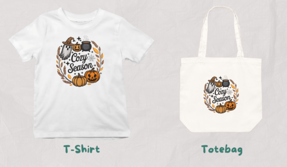
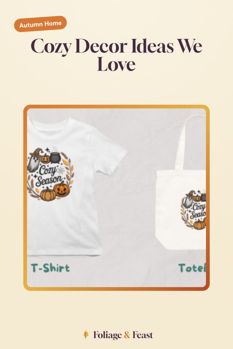
This is a simple “Cozy Season” design, lettering and not much else, and it is usually the first thing I put out. It signals to the whole room what we are doing now.
I printed it on a soft cream stock, dropped it in a thin wood frame, and set it on the side table next to the lamp. The lettering reads as warm brown, not black, which keeps it in the oatmeal lane instead of fighting it. My partner moved it to the bookshelf without asking and honestly it is better there.
Nitpick: the design comes through as an embroidery-style file, so the art has that stitched texture baked in. Printed small it looks great, but blow it up past about 8 by 10 and the faux-stitches start to look pixelly. Keep it modest.
A Tumbler Wrap I Stole for a Coaster Set
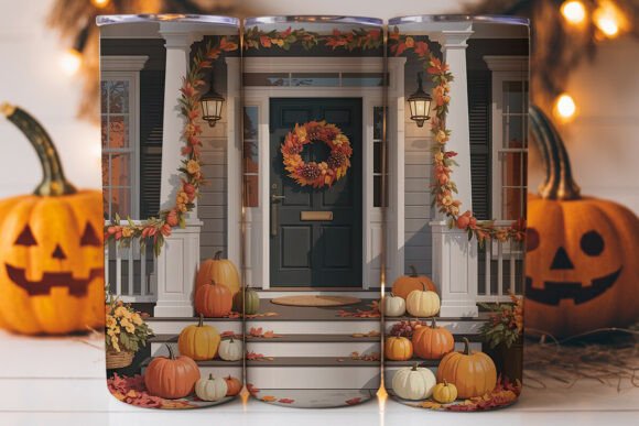
Technically this is a wrap for a 20oz tumbler. I do not own a relevant tumbler and I made coasters out of it instead, which is the kind of thing this hobby does to you.
The art is leafy and warm, lots of ambers and a soft tan, and printed at coaster size it sits perfectly with the oatmeal-and-amber thing I have going. I printed four, laminated them at the library, and stacked them on the coffee table. My partner actually uses coasters now, a small miracle I credit entirely to them being cute.
Nitpick: it is designed to wrap a curved cup, so the layout is long and skinny. Cutting square coasters out of it means you lose the ends of the design, and the leaves get chopped a bit awkwardly. I rearranged the elements first, which fixed it but added twenty minutes.
The Warmer Cousin for a Shelf Vignette
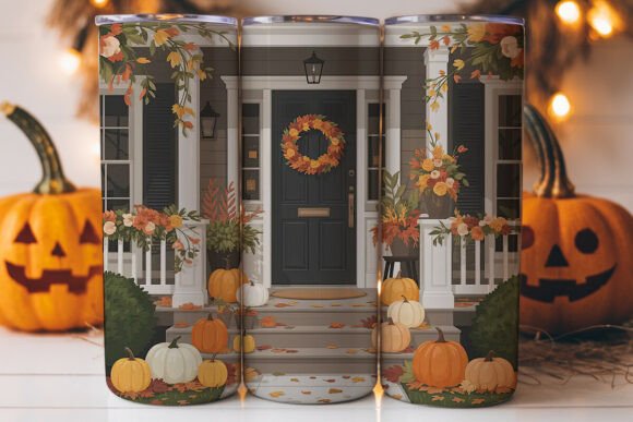
This is a second porch-decor wrap from the same world, but the palette skews a touch warmer, deeper rust mixed into the amber. I do not use these for cups at all anymore. I cut them into strips and use them as backing.
My trick: I slide a strip of this behind the books on the open shelf, so a band of warm autumn color peeks out behind the spines. It is the laziest possible way to make a bookshelf feel seasonal, and it comes straight down in November without leaving a mark.
Nitpick: the deeper rust tones are ink-hungry. Two strips and my printer’s color was visibly dragging. Run these early in a print session when the cartridge is full, not as an afterthought.
A Storybook Door That Anchors the Mantel
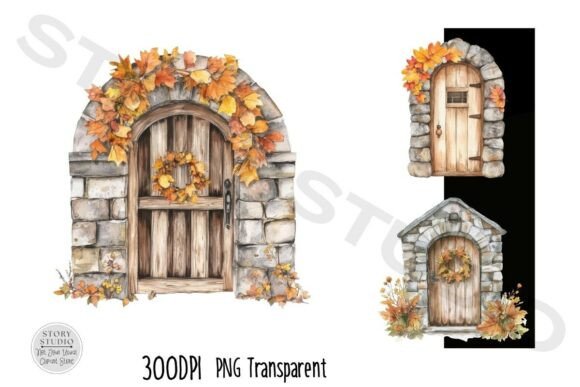
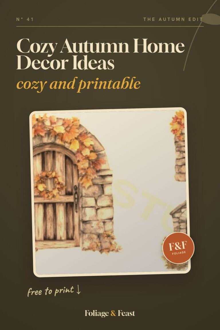
This stone-door clipart pack is the one piece of real art on my mantel, and it earns its spot. The illustrations are little autumn cottage doorways, stone arches, climbing leaves, the kind of cozy that feels like a children’s book in the best way.
I picked the warmest one in the pack, printed it good and large, and that is the print that lives in the frame that started too big. The wider mat I cut to fake the fit actually frames it beautifully now. My partner thinks I planned it. I did not. We move on.
Nitpick: the pack has a range of color temperatures, and a couple of the doors lean cool and bluish, which clashed hard with my amber room. I only used two of the warm ones. Just know you are buying a set and editing it down.
A Softer Print for the Window Ledge
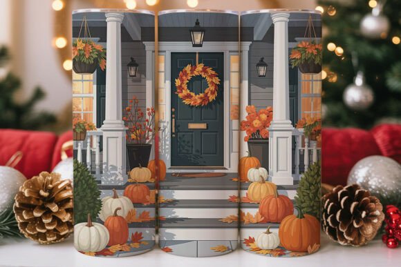
Another wrap, softer and lighter than the last two, more oatmeal than amber. This is the one I reach for when a spot needs warmth but not weight.
I printed it small, trimmed it into a little panel, and stood it on the window ledge behind a stub of candle. In the afternoon the light comes through the glass and the print and it all goes golden for about an hour. That hour is the entire reason I decorate at all.
Nitpick: lighter art means the cheap copy paper shows through if you hold it to the light, which on a window ledge you absolutely will. Cardstock fixes it. The 110 lb stuff is opaque enough that the glow stays on the front where it belongs.
The Original of the Set, Best Left Whole
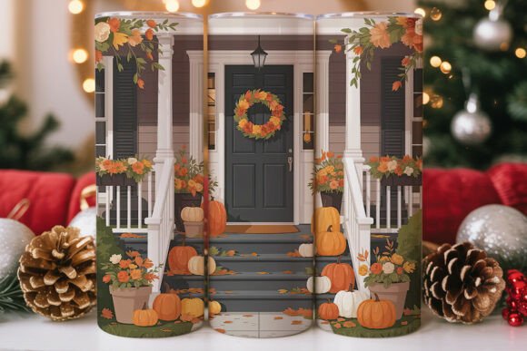
This is the base design the others riff on, and of the bunch it is the most balanced, a clean even spread of fall leaves across the strip. Because it is so balanced, this is the one I do not cut up.
I printed it full size and used it as a runner accent down the center of the entry console, weighed at each end with a small pumpkin. It is the closest any of these wraps gets to its intended job, just on a table instead of a cup. My partner calls the console “the leaf table” now and that is its name forever.
Nitpick: as a long strip it wants to curl at the ends, especially fresh out of the printer. I left mine under a stack of books overnight to flatten and that did the trick. Plan the night before, not the morning of company.
Harvest Art for the Gap Above the Sideboard
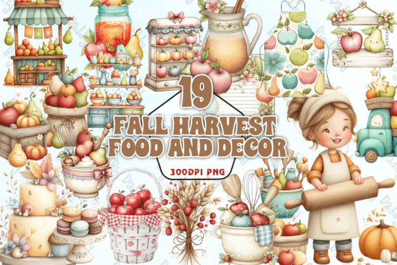
There is always one awkward blank wall, and mine is above the sideboard. This harvest food-and-decor PNG is what finally filled it. It is a warm spread of gourds, breads, and autumn bits, painterly and rich.
I printed it as a single larger piece and floated it in a simple frame. Against the oatmeal wall the ambers really sing, and it ties the dining edge of the room into the cozy living-room side. Two spaces, one palette, one print doing the stitching.
Nitpick: it is a PNG, so you size and place it yourself before printing, and at large sizes you want to check the resolution holds up. Mine was fine at frame size but I would not push it to poster scale. Print a test page first.
A Bundle I Raided for Throw-Pillow Inserts
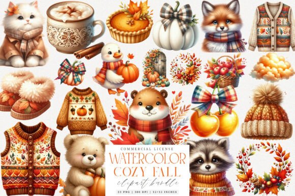
This sublimation bundle is meant for fabric transfer, but I am not running a craft factory, I am decorating a couch. So I used the art as printed inserts instead.
My partner has a thing for the reading chair, and I made a little printed card from this bundle, framed it tiny, and set it on the stack of books beside that chair. The bundle’s amber-and-cream tones drop right into the room without a fight. It is the detail nobody notices consciously and everybody feels.
Nitpick: sublimation files are built for transfer, so the colors are tuned to come out right on fabric, not paper. On my inkjet they printed a shade darker and warmer than the preview. I dialed the printer a touch lighter and it landed where I wanted.
The Companion Bundle for Small Repeated Accents
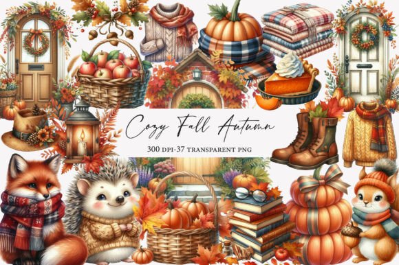
A sister bundle to the last one, slightly different art, same cream-and-amber family. I treat these two as a matched pair and that is half the secret of a pulled-together room: repeat a thing twice and it reads as intentional.
I printed a couple of small motifs from this one and tucked them into a tray on the ottoman, next to the remote and a candle. Tiny, low-effort, but it carries the palette into the dead center of the room where there was nothing seasonal before.
Nitpick: same fabric-tuned color quirk as its companion, so expect to nudge your print settings lighter. And because the motifs are small, any printer banding shows more. I cleaned the print heads before running these and it was the difference between crisp and streaky.
A Sweet Little Set to Break the Seriousness
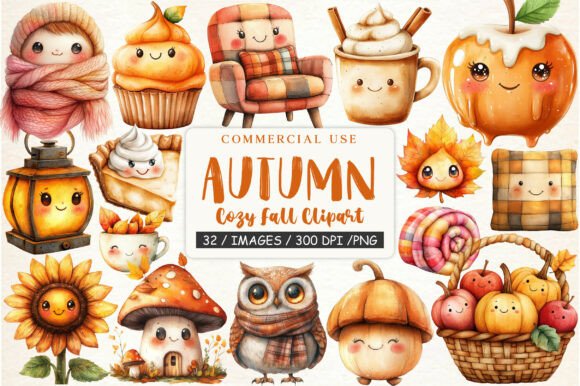
Last piece, and it is on purpose the least serious. This kawaii cozy fall clipart is cute and round and a little silly, all soft pumpkins and smiling leaves, and a room of oatmeal-and-amber restraint needs one wink.
I printed one small motif, framed it in a tiny stand frame, and put it on the windowsill where my partner makes coffee. It is the one piece that gets a smile instead of a nod. Not everything in a cozy room has to be tasteful. One thing should just be sweet.
Nitpick: kawaii art lives or dies on clean edges, and printed at the wrong size the soft outlines go fuzzy and it reads cheap. I printed it deliberately small, where the inkjet keeps the lines tight, and it held up. Resist the urge to size it big.
Frequently Asked Questions
Is farmhouse decor going out of style?
The shiplap-and-galvanized-everything version, maybe, but the warm, lived-in cozy side of it is not going anywhere, it is just softening. The room I described is barely farmhouse at all, it is oatmeal wool, warm amber, and a few good prints. That holds up year after year.
My honest take: chasing what is in or out is how you end up redecorating every autumn. Pick a narrow palette you actually like, lean on printables you can swap cheaply, and the trend question stops mattering.
Can I print these at home?
Yes, every piece in this room came off my home inkjet, which is not fancy and complains often. Plain paper is fine for things behind glass, but anything standing on a ledge or table wants 110 lb cardstock so the light does not shine through and the print does not curl.
No printer at home? The library print station handles the open-and-print files for cents a page. For the PNG art, size it in a free doc first, then print there. Bring your own cardstock if you want the heavier feel.
What file formats do these designs come in?
It depends on the item. Several here are PNG art, which means you place and size them yourself in a doc before printing. The sublimation bundles download as transfer-ready art that also prints fine on paper if you nudge the color lighter.
The shop page for each one spells out exactly what is inside. I always glance at that before buying so I know whether I am getting an open-and-print file or something I need to drop into a layout first.
Do I need a Cricut or Silhouette to use these?
For this whole list, no. Everything here is print-and-frame or print-and-trim, no cutting machine required. Scissors and a frame you already own do the job.
The sublimation bundles are built with fabric crafters in mind, but you do not have to use them that way. I print them on paper for framed accents and skip the heat press entirely. A machine would open more options, but nothing in this room needed one.
Before You Print
The room is never really finished, which is the part I like. A print moves to the bookshelf, a wrap becomes a coaster, a too-big frame gets a too-wide mat and somehow looks better for it. It is cheap, it is forgiving, and it changes when I feel like changing it.
My partner pretends not to notice the slow takeover every October, then quietly claims the warmest chair under the most blankets. That is the whole point of the oatmeal-and-amber cave. I built it for both of us. He just will not say so.