This post contains affiliate links. If you grab one of the printables I recommend, I may earn a small commission at no extra cost to you.
Every year I tell myself I will buy the fancy letterpress place cards, and every year I run out of November before I run out of good intentions. So I print them. The ones I love are the kind you print flat, score a line, fold over, and prop at each plate. No store run, no waiting on shipping, just a heavy sheet of cardstock and a steady hand.
Last week I handed the folding off to my partner, who had never folded a place card in his life and announced this with some pride. We sat at the kitchen table with a stack of fresh prints and a pair of kitchen scissors, and I learned a thing the hard way. He cut a whole row crooked, every single one leaning the same sad direction, because scissors and a tired wrist do not make a straight line at ten at night. We switched to a paper trimmer after that and the rest came out clean. The crooked row went in the recycling, except for one I kept on the fridge as a warning.
A few of the files below are ones I actually printed and folded this season. Some of the links are affiliate links, so if you grab one I get a small cut and you pay the same. Now let me show you what made the cut.
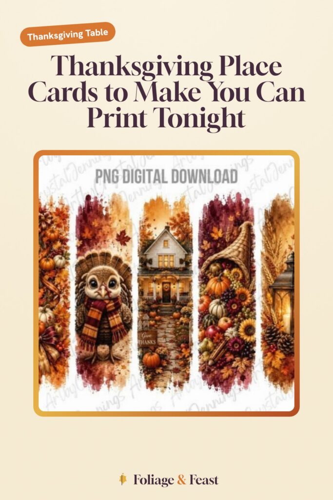
Brushstroke Banners for the Names
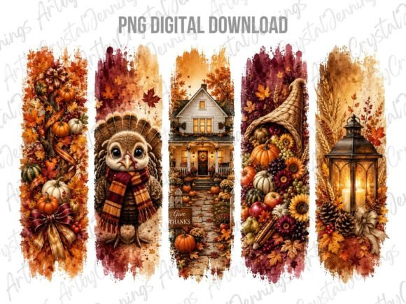
This one is loose painted strokes in fall colors, the kind of thing that reads as art even when it is just sitting behind a guest’s name. I printed the brushstrokes as a header band across the top of each folded card and wrote the names underneath in a fat brown marker. On 110 lb cardstock the paint texture holds up and does not look flat.
The trick with a PNG like this is the transparent background, so it drops onto whatever card base you already made without a white box fighting you. I layered it over a cream sheet and it looked deliberate.
One nitpick. The strokes lean warm orange, almost neon in a couple of the files, so if your table runs more burgundy you will want to print a test sheet first. I did not, and my first batch clashed with the napkins.
The Bear That Won Over the Kids’ Table
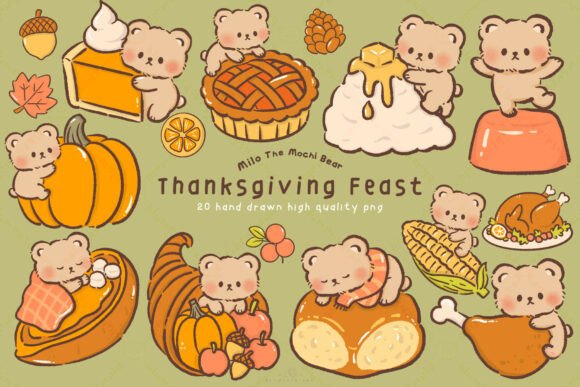
Round little bears at a feast, soft and silly, and the under-eight crowd lost their minds. I printed these small, folded them into tent cards, and set one at each spot at the kids’ table with their name in bubble letters. The four-year-old refused to eat until everyone admired hers.
They fold cleanly because the art sits in the center with room around it, so your score line does not cut through a bear’s face. I used a bone folder for the crease and they stood up on their own without curling.
The nitpick is scale. The bears are detailed, and if you shrink them too small for a place card the tiny faces go muddy on an inkjet. I kept mine around three inches wide and that was the floor before the cuteness blurred.
A Whole Tablescape in One Folder
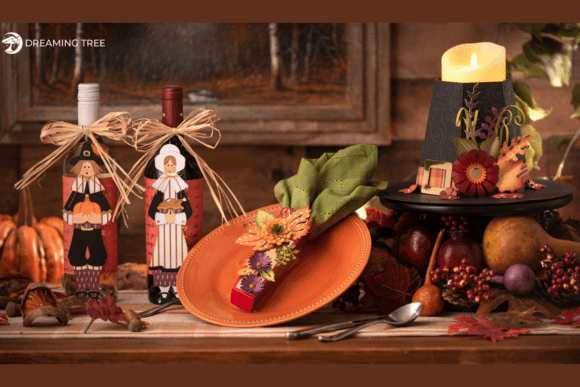
This is the bundle that does the heavy lifting, a stack of cut shapes meant to build a coordinated table, place cards included. I ran the card shapes through my Silhouette so the folds were pre-scored and the corners came out sharp, no scissors, no crooked row, no partner sulking.
The nice part is everything matches, so the place cards talk to the napkin rings and the little signs without me playing color detective. I picked the leaf-shaped cards and they looked far more finished than the time I spent justified.
Nitpick: it is an SVG bundle, so you really do want a cutting machine to get the value out of it. You can print and hand-cut the flat versions, but then you are back at the kitchen table with scissors, and we know how that ended.
A Turkey With Some Personality
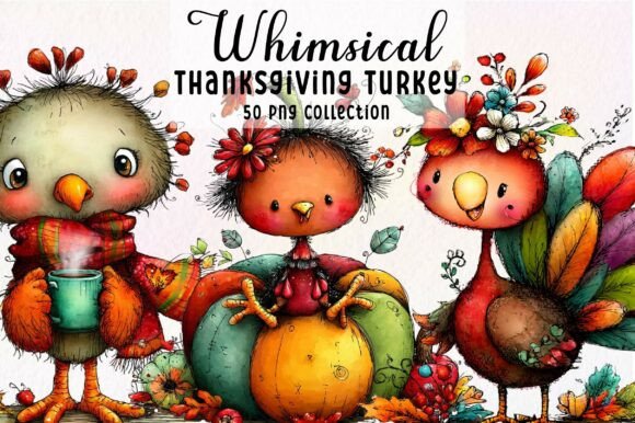
These turkeys are drawn with a wink, all puffed tails and goofy expressions, not the stiff clip art you see on every grocery flyer. I tucked one turkey onto the front flap of each folded card and let the bird do the decorating while the name sat below in plain ink.
The set gives you a few turkey poses, so I varied them down the table and nobody got the exact same card as their neighbor. Small thing, but it makes the table feel made instead of mass printed.
Nitpick: a couple of the turkeys have very fine line work in the feathers, and on regular copy paper those lines fill in and turn into a smudge. Heavy paper and a clean print head, or skip the busiest bird in the set.
Cornucopia for the Grown-Up End
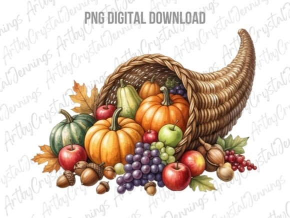
A spilling horn of gourds and fruit, classic and a little old-fashioned, which is exactly what I wanted for the adult end of the table. I printed it as a small motif in the corner of each folded card so it framed the name without crowding it.
It prints rich, lots of deep oranges and a touch of plum, and it photographed well in the dim dinner light when I finally remembered to take pictures. Propped against a real pinecone it looked like I planned the whole thing.
Nitpick: this file is dense with color, so it drinks ink. I went through more amber than I expected and had to nurse the last few cards out of a fading cartridge. Print these first while your ink is fresh.
Sunflowers Borrowed From a Sign
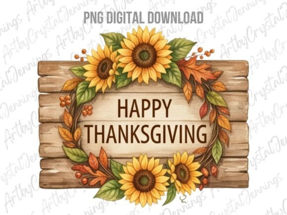
This is designed as a faux wood sign, but the sunflower-and-plank look made a charming place card front when I cropped it down. I printed a slim strip of the wood-grain sunflower art along the bottom fold so each card looked like a tiny rustic sign with the name above it.
The wood texture gives the cardstock a heft it does not actually have, a nice cheat. On matte paper the grain reads convincingly instead of looking like a printed photo.
Nitpick: the original is sized big, for a sign, so you are cropping and resizing to fit a place card and you lose some of the border text in the process. I trimmed mine to just the flowers and grain, which honestly looked cleaner anyway.
Sublimation Pumpkins, Used on Paper
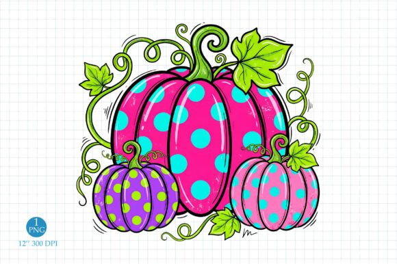
Yes, it is built for sublimation onto mugs and shirts, but the pumpkin cluster is so crisp and saturated that I printed it straight onto cardstock for the cards and felt no shame. Bold pumpkins in a tidy little pile, folded so the pile sits on the front flap.
Because sublimation art is made to stay vivid through heat, the colors come off the printer punchy, which is great when your inkjet is otherwise running tired. These were the brightest cards on the table.
Nitpick: sublimation files often come with a transparent or odd-shaped canvas, so when I dropped it onto a card I had to add my own background or the pumpkins floated awkwardly. Two minutes in any editor fixed it, but it is not a print-and-go file.
Soft Watercolor for a Quieter Table
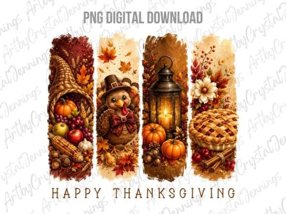
A watercolor turkey, gentle washes and blurry edges, the opposite of the punchy sublimation set. I used these when I wanted the table to feel calm and grown, printed pale on cream cardstock with the name in a thin gray pen so the bird stayed the star.
Watercolor art forgives a tired printer, because the soft edges hide the streaks an old cartridge leaves behind. My printer is on its last legs and these still looked intentional.
Nitpick: the washes are light, so if your cardstock is bright white the whole card can read a little washed out and timid. I switched to an ivory sheet and the watercolor suddenly had something to sit against.
Plain Pumpkins That Just Work
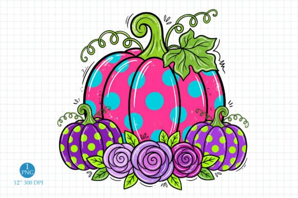
Not the sublimation pumpkins, the simpler painted ones, and these were my workhorse. Clean pumpkins, no fuss, the file I reached for when I had eight more cards to fold and the turkey was already in the oven. Print, fold, name, done.
The simplicity is the point. Folded into a tent card with the name beside the pumpkins, it looks finished without asking anything of you. I made the spare set out of these for the guests who texted at noon to ask if they could bring a cousin.
Nitpick: simple also means it can feel a touch generic if the whole table uses only this file. I mixed it with the watercolor and brushstroke cards so it had some friends and did not carry the table alone.
The Preppy Floral One for Show
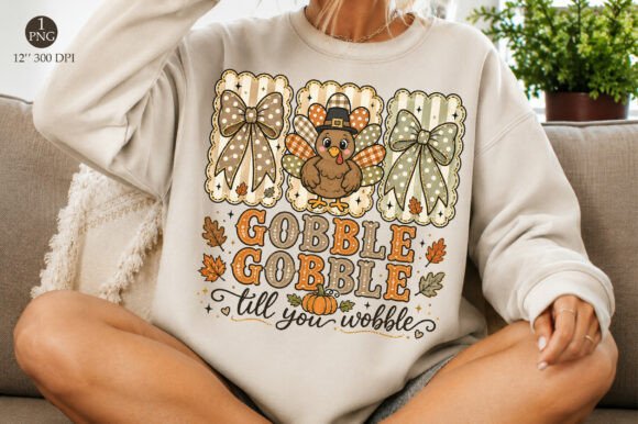
This is the dressed-up card, a floral wreath around a tidy Gobble in that preppy grandmillennial style. I saved it for the head of the table and the guests I wanted to feel a little fussed over. Printed full on the front flap, it does not need a thing added.
The floral border doubles as a frame for the name, so I just wrote inside the wreath and it looked like the card was designed around that exact name. Cheap trick, great result.
Nitpick: there is a lot of fine floral detail packed tight, so it wants real resolution and good paper. I printed one on cheap paper to test and the flowers turned to mush. On 110 lb it was the prettiest card I made all season.
Frequently Asked Questions
How to make thanksgiving place cards?
Print a design onto heavy cardstock, score a fold line across the middle, fold it into a little tent, and write or print the name on the front. That is the whole job. I print flat, run a bone folder or the back of a butter knife along the crease so the fold is sharp, and stand each one at a plate.
The only real skill is cutting straight, and that is where I would skip the scissors. My partner proved scissors plus a tired wrist equals a crooked row. A paper trimmer or a cutting machine keeps every card the same height, which is what makes a row of them look done.
Can I print these at home?
Yes, that is the entire idea. I print mine on a home inkjet that has seen better days, and as long as I use decent cardstock and have ink that is not gasping, they come out great. The library printer works too if your machine quits on you mid-batch, which mine has.
For place cards specifically, reach for 110 lb cardstock if you can. The thinner stuff folds limp and starts to lean by the time the gravy goes around.
What file formats do these designs come in?
It depends on the design. The painted and watercolor ones come as PNG, which drop straight onto a card with no white box behind them. The bundle comes as cut files for a machine.
When you grab one, the shop listing tells you what is inside the download. If you only want to print and fold by hand, look for the PNG ones. If you have a Cricut or Silhouette and want pre-scored cards, the cut-file bundle earns its keep.
Do I need a Cricut or Silhouette to use these?
For most of these, no. The PNG designs print and fold with nothing fancier than a printer, a trimmer, and your hands. I made my whole table that way for years before I owned a cutting machine.
The one exception is the tablescape bundle, which is built as cut files. You can print the flat versions and hand-cut them, but the real payoff there is feeding it to a machine that scores the folds for you. If you do not have one, lean on the PNG sets instead.
Before You Print
I still have the one crooked card on the fridge, the survivor from my partner’s scissor era, and it makes me laugh every time I open it for the milk. The point of printing your own place cards is not perfection. It is that you can fix a bad batch at ten at night with a trimmer and a second cup of tea, and nobody at the table ever knows.
Grab one file, print a test sheet before you commit the whole stack, and fold the first card slow. If it goes sideways, switch tools and keep going. The turkey will still be late and the cards will still look like you tried, which is the same thing as looking good.