This post contains affiliate links. If you grab one of the printables I recommend, I may earn a small commission at no extra cost to you.
My living-room gallery wall is held together by hope and removable strips. I rebuild it every fall the way some people swap out a wreath. Down comes the summer stuff, up go the leaves and pumpkins, and for about a week the floor is covered in frames while I decide what goes where.
Most of what hangs there is just a file I printed at home. Not a single piece cost more than the paper. My mom keeps asking which shop framed them, and she does not love the answer, which is me, on the rug, at nine at night, swearing at a frame that would not lie flat. The trick is good line art and a heavy enough sheet that it does not buckle behind glass.
A few of the files below are ones I actually hung, and yes, some of these are affiliate links, so if you grab one I might get a tiny cut. Costs you nothing. Here is what made the wall this year.
The Harvest Icons That Anchored The Whole Wall
I started the living-room wall with this harvest icons set because it gave me a dozen little shapes to play with instead of one big print I had to commit to. Pumpkins, a wheat sheaf, an acorn, all clean and simple. I printed three of them at different sizes on 110 lb cardstock and clustered them in the middle of the wall, and that one move pulled the rest of the layout into place.
Because it scales as vector art, I blew one pumpkin up huge for a single frame and shrank the acorn down tiny for a 5×7, and neither went fuzzy on me. I leaned the colors ochre, with a couple in a muted sage so the wall did not read like a candy aisle.
One nitpick. Some of the icons sit very high in the frame, so if you center them by eye you end up with a big empty bottom. I nudged them down a hair in the print dialog and reprinted two before they looked right.
Same Harvest, Stripped Down To Outlines
This is the line-art cousin of the set above, all thin outlines and no fill, and it ended up being my favorite for the skinny frames near the light switch. Outline art does something forgiving on a wall. It reads as calm even when you crowd six frames together.
I printed these in plain black on warm ivory paper, the slightly cream kind, so they did not glare against the ochre pieces. My sister liked these better than the filled icons, which I will never admit to her face.
The nitpick here is line weight. A couple of the outlines are hair-thin, and my inkjet skipped a tiny gap in one leaf stem on the first pass. I bumped the print quality up a notch and the second copy came out solid.
The One Print My Sister Stood And Stared At
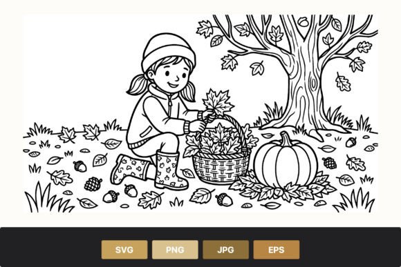
I almost scrolled past the girl collecting leaves, and I am glad I did not, because it became the piece that gives the wall a story instead of just a pile of pumpkins. It is a single figure, bent over, gathering leaves, all in soft line work.
I gave it the biggest frame in the cluster and hung it slightly off-center, which my sister noticed and then decided she liked. I printed it on the heavy ivory again so the lines had some body to them. It is the print people walk up to.
One snag. The original file came sized for an 8×10, and the frame I had ready was an 8.5×11, so I had a thin white border with the figure floating a little low. I trimmed the sheet down by hand with a ruler and a craft knife, lost the border, and it sat right after that.
Pumpkins, A Lantern, And A Pair Of Boots Walk Onto My Wall
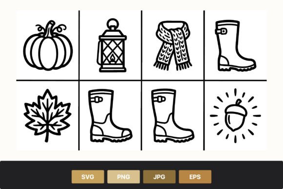
This little trio of pumpkin, lantern, and boots is the print I hung by the hallway light, the one you pass on the way to the kitchen. It is cozy without trying, and it fit the narrow vertical frame I had been ignoring for two years.
The hallway gets afternoon sun, so I picked the line-art version on purpose, figuring outlines would fade slower than a big block of color if the light hits it all season. I kept the ink black and let the ivory paper carry the warmth.
Nitpick: the boots sit right at the bottom edge of the design, so there is almost no margin under them. In the hallway frame they looked like they were about to step off the page. I scaled the print to ninety-five percent to buy myself a sliver of breathing room.
Black And White Icons For When Color Felt Like Too Much
By the time I got to the lower row of the gallery wall I was tired of choosing colors, and this black-and-white icon set was a relief. Just clean shapes, no palette decisions, no second-guessing the ochre versus the sage.
I printed a strip of four of these small and lined them up in matching thin frames along the bottom of the cluster, which gave the busy wall a quiet edge to rest on. The hallway version of me appreciated not having to swap ink.
The one gripe is spacing inside the file. A few icons are packed tight to the frame edge, so when I tried to print two per sheet to save paper, they nearly touched in the middle. I added a margin manually and printed them one to a page instead.
A Scarf, A Pumpkin, A Leaf, And My Whole Mood In October
Pumpkin, scarf, leaf. That is the set, and honestly that is October in three drawings. I used these as the filler pieces, the small frames that plug the gaps between the bigger prints so the wall does not look like it has holes.
I printed the scarf one in a soft sage to break up all the ochre, and it turned out to be the color my mom kept pointing at. These are line art, so a tint reads as gentle rather than loud, which is exactly what a crowded wall needs.
Nitpick: the leaf icon is noticeably bigger than the pumpkin and the scarf in the file, so when I framed all three the same size, the leaf felt like it was shouting. I shrank just the leaf in print and matched the visual weight, then they sat as a set.
The Folk-Art Basket That Warmed Up A Cold Corner
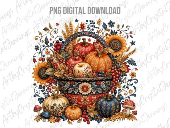
The hallway has a dead corner where light barely reaches, and this folk-art harvest basket is what finally fixed it. It has that hand-painted, slightly naive look, full of round shapes and warm tones, and it carries color in a way the line art does not.
Because it is a full-color PNG, I leaned into it and printed it big, then let the ochre and rust in the artwork do the heavy lifting in the gloomy corner. It glows a little even in low light, which is more than I can say for that corner before.
One nitpick. It is a PNG with a transparent background, so on my first print the basket floated on stark white that did not match my warm paper. I dropped a soft cream rectangle behind it in my print app first, and the second copy blended right in.
Stitch-Style Maple Leaves That Look Hand-Sewn
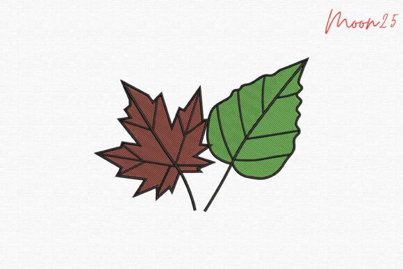
This maple and green leaf piece has a stitched, embroidered look to it, like someone sewed the leaves rather than drew them, and that texture made it stand out on a wall full of flat line art. It reads as handmade even printed flat.
I hung it in the living room beside the harvest icons, where the green leaf gave me a natural bridge to the sage pieces I had scattered around. My sister assumed it was an actual cross-stitch in a frame and asked who made it.
The nitpick is the green. It is a true fresh green, more late-summer than deep fall, so next to my ochre it can look a touch out of season. I printed it slightly warmer by nudging the color balance, and it settled into the autumn group.
Doodly Line Art For The Frames That Refuse To Match

Every gallery wall has those two or three odd frames that do not match anything, and this whimsical doodle line art is what I fed them. It is loose and playful, the kind of drawing that looks like a happy margin sketch, and it makes mismatched frames feel intentional.
I printed a handful of the doodles small and tucked them into the orphan frames around the edge of the living-room cluster. Black line on ivory again, keeping my one boring rule so the wall held together.
Nitpick: the doodles vary a lot in size inside the set, so eyeballing which one fits which frame took me three reprints. I learned to measure the frame opening first and scale the doodle to it before hitting print.
A Folk-Art Turkey For The Last Empty Hook
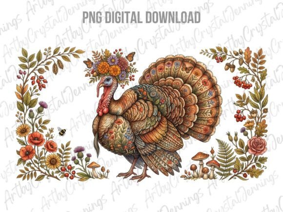
There was one hook left near the top of the wall, and I saved it for this folk-art turkey because by mid-November a turkey earns its spot. It has the same charming, hand-painted folk style as the basket, all warm feathers and rounded shapes.
I printed it in full color, kept it on the larger side, and hung it where you catch it first walking into the living room. It quietly tells you the wall is dressed for Thanksgiving now, not just fall, without me having to redo a thing.
One nitpick, same as the basket. It is a PNG on transparent, so it prints onto bare white unless you do something about it. I laid a thin rust-toned band behind it this time to tie it to the ochre, and that small step made it look framed on purpose.
Frequently Asked Questions
How to stop posters falling down?
My whole gallery wall fell off twice before I figured this out. Tape and a single pushpin will not hold a framed print through a season of doors slamming. What worked for me was strips rated for double the weight of the frame, pressed firm for thirty seconds, then left alone overnight before I hung anything.
For the heavier folk-art prints I gave up on stick-on anything and put a real picture hook with a tiny nail into the wall. Boring, but the turkey has not moved since.
How to keep a poster from falling off the wall?
Two things help. First, hang it from the top, not the middle, so gravity pulls it flat against the wall instead of peeling it forward. A print taped only by its bottom corners will always curl off eventually.
Second, mind the surface. My hallway has a slightly textured paint, and adhesive strips slide on it within a day. I wiped the spot clean, let it fully dry, and used a stronger strip there than I did in the living room, where the wall is smooth.
Can I print these at home?
Yes, that is the whole point, and every piece on this wall came off my own inkjet at home. The line-art ones print fine on a basic printer. For the full-color folk-art pieces I bumped the quality setting up so the warm tones did not come out chalky.
If your printer is as tired as mine, the library or a copy shop will print a few sheets cheaply, and a heavier 110 lb cardstock there will look far better behind glass than thin copy paper.
What file formats do these designs come in?
It varies by piece, and the listing for each one spells it out before you buy. Several here are vector files that scale up without going fuzzy, which is why I could print the same pumpkin big in one frame and tiny in another.
A couple of the folk-art designs are PNG images instead, on a clear background. Those print beautifully in color, just know they land on bare white unless you set a colored backdrop behind them first, the way I did to match my warm paper.
Before You Print
The wall is done for now, though I say that every year and then reprint something in December. Ten files, a stack of frames, and a roll of strips that I clearly underestimated. My sister still thinks a shop did it. My mom still hangs hers an inch too high.
If you only grab one to start, make it the girl collecting leaves and hang it a little off-center on purpose. Mine trims the bottom border, sits crooked, and gets walked up to more than anything else on the wall.